VoidZero · design research
A measured teardown of voidzero.dev, the marketing site of VoidZero Inc., the company behind Vite, Vite+, Vitest, Rolldown and Oxc. Captured on 2026-11-21 at 1440×900 (desktop), 768 (tablet) and 390 (phone).
Every number in these docs comes from getComputedStyle, the site's shipped CSS (/assets/style.-5NRHm21.css) or pixel measurement on the screenshots. Estimates carry ≈.

The site in one paragraph
voidzero.dev is a VitePress site (<meta name="generator" content="VitePress v2.0.0-alpha.20">) with a Tailwind v4 token layer and Vue components on top. It is a light page drawn like an engineering blueprint: a 1440px column with 1px side rails, full-width 1px horizontal rules, and small triangle "ticks" where the rules meet the rails. Into that calm frame the site drops loud, grainy, high-saturation light-streak textures (violet, green, orange, cyan), one per product. Type is one commercial grotesque (APK Protocol) plus a commercial mono (KH Teka Mono) used for // LABELS, terminal output and metadata. The single brand accent is electric violet #6C3BFF.
What is in here
| # |
Doc |
What it covers |
| — |
Public pages |
All 51 public URLs, grouped (blog, changelog recaps, case studies, legal) |
| 01 |
Design principles |
The six ideas the whole site follows, and why |
| 02 |
Color system |
17 named color tokens, measured hex, WCAG contrast |
| 03 |
Typography |
APK Protocol + KH Teka Mono + Inter, foundries, licences, free substitutes, full scale |
| 04 |
Layout, grid and spacing |
The 1440 rail frame, tick marks, section heights, spacing |
| 05 |
Heroes |
6 hero patterns (home, about, blog, post, newsletter, legal) |
| 06 |
Section types |
16 section patterns, incl. product tab rail, stat bento, ASCII band |
| 07 |
Copywriting and voice |
Headline formulas, // labels, recap naming |
| 08 |
Components |
Nav, banner, 4 button types, cards, chips, inputs, footer |
| 09 |
Art direction |
Light-streak textures, isometric stacks, ASCII art, covers, logos |
| 10 |
Brand assets and graphics inventory |
Every graphic type, how it is made, how to recreate it, the official kit |
| 11 |
Motion and interaction |
Rive scenes, the shine headline, marquee, hover physics |
| 12 |
Glossary |
The words to brief a designer or developer |
| 13 |
Build recipe |
CSS tokens and skeleton code |
Page reviews
| Page |
Template |
Doc |
/ |
Home |
home |
/about |
About / team |
about |
/blog |
Blog index |
blog |
/posts/announcing-vite-plus-1-0, /posts/announcing-series-a |
Blog post (announcement) |
blog post |
/posts/whats-new-oct-2026, /posts/whats-new-sep-2026 |
Monthly recap (the changelog) |
recap |
/posts/case-study-framer-rolldown |
Customer story |
case study |
/newsletter |
Newsletter |
newsletter |
/legal/terms |
Legal |
legal |
/branding |
Branding (empty) |
branding |
| all |
Header, banner, footer |
shared header and footer |
Five things worth stealing
- The rail frame with ticks. A 1px border on the left and right of a 1440px column, full-width 1px rules between sections, and a 5px CSS triangle where each rule meets a rail. It costs nothing and it makes a plain page look engineered. See 04.
- One texture per product. Each product gets a grainy light-streak image in its own color. A terminal screenshot sits on top. The texture says "fast" and the terminal says "real". See 09.
- The
// comment label. Eyebrows are written as code comments in a mono font: // UPDATES, // CREATOR OF VUE.JS. The audience reads code all day, so the label feels native. See 07.
- The shine headline. The H1 is filled with a 400%-wide gradient that is dark except for a violet band. A 5s animation slides it once and stops on the violet, leaving "Script" and "pany" lit. See 11.
- The gradient-ring primary button. The primary button is a dark pill inside a 3px ring cut from a moving texture image (
move-background, 16s loop). See 08.
Folders
images/full/: 11 full-page captures at 1440px.images/<page>/: 41 section crops.images/assets/: 35 close-ups of graphics, components and the official wallpaper set.images/responsive/: home at 390 and 768, blog and post at 390.data/: the raw measurement JSON per page (<page>.json text styles and colors, <page>.probe.json motion, images, radii, sections, <page>.blocks.json section bounds), hashmap.json (the VitePress route list) and public-pages.json.
Gaps
- Rive scenes are opaque. The hero stack, the product art and the About mark are Rive
.riv files drawn on <canvas>. Their timelines and easing are inside the binary file, so they are described, not measured.
/branding renders empty. The route returns 200 but shows only the header and footer. The real kit is on GitHub (see 10).- Embedded X posts in recaps render blank in full-page captures (cross-origin iframes). One viewport capture shows them: recap embed.
- Dark mode of the docs layer exists (VitePress
.dark class) but marketing pages pin their own data-theme, so the light/dark section mix you see is fixed by design, not by the OS setting.
- APK Protocol foundry is attributed by a third-party directory (Autograph / Peter Korsman). The site CSS names only the family.
Public pages · voidzero.dev
51 public URLs on voidzero.dev (50 pages plus the RSS feed), plus 6 product sites on their own domains.
How the list was built: voidzero.dev has no robots.txt and no sitemap.xml (both return the 404 page). The list comes from /hashmap.json, the VitePress page manifest that names all 50 routes, plus /feed.xml (42 posts, newest first) and the header/footer links. All routes were checked and return 200.
There is no separate changelog. The monthly Tales from the Void recap posts fill that role, so they are listed as the changelog.
Marketing (4)
Blog (24)
Changelog (monthly “Tales from the Void” recaps) (18)
Customer stories (case studies) (2)
Legal (3)
Product sites linked from voidzero.dev (separate domains) (6)
01 · Design principles
Six ideas run through every page of voidzero.dev. Each one is visible in the measurements, and each one has a reason that follows from who the site talks to: JavaScript developers, open-source maintainers, and the engineering leaders and investors who watch them.
1. A blueprint frame around everything
What. Every section sits inside .wrapper: max-width 1440px (90rem), a 1px left and right border in #E5E4E7 (--color-stroke, light) or #3B3440 (--color-nickel, dark), and a 1px top border. Where a top border meets a side rail, a 5px CSS triangle (.wrapper--ticks:before/:after) points inward. Empty 120px "spacer" wrappers separate groups of sections.
Why. It makes the page read like a technical drawing or a terminal layout. The audience trusts precision. Visible structure signals "these people care about the build", which is exactly the claim of a toolchain company. It also makes the page easy to extend: a new section is one more box in the frame.
2. Calm frame, loud art
What. The frame is white (#FFFFFF), near-black text (#16171D), one gray (#867E8E). All saturation lives in rectangular image panels: grainy light-streak textures in violet, green, orange and cyan, 593×480–553px each on the home page.
Why. Restraint in the UI keeps the reading load low. Putting all color in contained panels gives the eye a reward every scroll without making text harder to read. Each product owns one hue, so color becomes navigation.
3. Show the real thing
What. Product art is a terminal or config screenshot (vp create, VITE v7.1.5 ready in 159 ms, Vitest output, a rolldown config) laid on the texture. Stats are live numbers: 4,459,686,127 total downloads, 130.8m+ weekly npm downloads, 83.9k+ GitHub stars.
Why. Developers distrust marketing claims and trust output they recognise. A terminal frame is proof, and big real numbers are social proof that a VC-backed company needs.
4. Code is the brand voice
What. Eyebrows and labels are code comments in KH Teka Mono, uppercase, 12px, letter-spacing: 0.3px (// UPDATES, // CREATOR OF JEST, // YARN & METRO). The logo is VOID(Ø), a pun on JavaScript's void(0). A "resources" block shows a .filter() chain as its caption.
Why. It speaks the audience's language and it is self-aware. The joke only lands for people who write JS, which is the point: it filters for the right reader.
5. One accent, used sparingly
What. Electric violet #6C3BFF (--color-electric, aliased to --color-brand) appears in the H1 shine band, links in posts, inline code text, the active nav dot and the chart line. The lighter #B39AFF (--color-vite) is the Vite+ tab tint.
Why. Violet is inherited from Vite's purple-to-yellow logo and Vite+'s purple. Using it only for emphasis keeps it meaningful: if something is violet, it is a link or the thing to look at.
6. Motion only where it says "alive"
What. Three moving things on the home page: the Rive hero stack (layers hover and the top tile glows), the one-shot 5s H1 shine, and a 2s pulsing green dot next to prod server / running. Hover feedback is 150ms (--default-transition-duration: .15s) with cubic-bezier(.4,0,.2,1). prefers-reduced-motion: reduce sets every animation to 1ms.
Why. The page sells speed. Slow, decorative motion would contradict that, so motion is either instant feedback or a single "the server is running" signal.
Summary table
| Principle |
Main evidence |
Token / value |
| Blueprint frame |
.wrapper, .wrapper--ticks |
1440px, 1px #E5E4E7, 5px tick |
| Calm frame, loud art |
texture panels |
#FFF / #16171D / #867E8E + JPG textures |
| Show the real thing |
terminal art, stat tiles |
60px stat numerals |
| Code voice |
// labels |
KH Teka Mono 12px, +0.3px, uppercase |
| One accent |
links, shine, chart |
#6C3BFF |
| Motion = alive |
Rive, shine, pulse |
150ms hover, 5s shine, 2s pulse |
02 · Color system
VoidZero defines its palette as Tailwind v4 theme variables (--color-*) and maps VitePress variables onto them (--vp-c-text-1: var(--color-primary) and so on). All values below are copied from the shipped CSS and confirmed with getComputedStyle.
Core tokens
| Token |
Hex |
Role (measured where) |
--color-white |
#FFFFFF |
Page background (body = rgb(255,255,255)), light buttons |
--color-primary |
#16171D |
Text on light; background of dark bands (.bg-primary, the OSS block, footer) |
--color-grey |
#867E8E |
Body copy on marketing pages (.marketing-layout p), labels, stars |
--color-nickel |
#3B3440 |
Dark-band borders; long-form body text in posts (rgb(59,52,64), 48 paragraphs on the Vite+ 1.0 post); 13 filled elements on /blog |
--color-stroke |
#E5E4E7 |
Every 1px rule and rail on light, tick triangles |
--color-beige |
#F4F3EC |
Team card fills on /about (21 elements) |
| — |
#FBFAF7 |
Mission band on the home page (rgb(251,250,247)) |
--color-slate |
#14121A |
Product panel background inside the dark OSS block (9 elements on home) |
--color-midnight |
#0C0912 |
Deepest dark (token defined) |
Brand accents
| Token |
Hex |
Role |
--color-electric = --color-brand |
#6C3BFF |
Shine band in H1, links and inline-code text in posts, chart line |
--color-vite |
#B39AFF |
Vite+ tab tint; alt --color-brand in one scope |
--color-ruby |
#863BFF |
Secondary violet |
--color-space |
#110033 |
Inline code text on marketing pages |
--color-wine |
#140033 |
Deep violet ground |
--color-aqua |
#32F3E9 |
Oxc texture family |
--color-zest |
#22FF73 |
Vitest texture family, "unit" badges |
| status green |
#00B442 |
6×6px pulsing dot in prod server / running |
The product hues follow each project's existing logo color: Vite+ and Vite violet, Vitest green, Rolldown orange, Oxc cyan. VoidZero did not invent new colors for its products; it gathered the family's colors into one system.
Gradients that are real CSS
| Where |
Value |
| Announcement banner |
linear-gradient(90deg, rgba(140,0,255,.54) 0%, … 38%, rgba(186,24,154,.58) 48%, rgba(244,86,58,.86) 60%, …) over footer.C-44yuQw.jpg, plus a dark scrim linear-gradient(90deg, rgba(8,6,13,.68), rgba(8,6,13,.18) 44%, rgba(8,6,13,.24)) |
| H1 shine (light) |
linear-gradient(110deg, #16171D 0%, #16171D 40%, #6C3BFF 48%, #6C3BFF 52%, #16171D 60%, #16171D 100%), background-size: 400% 100%, clipped to text |
H1 shine (dark, /about) |
same with #FFFFFF in place of #16171D |
Everything else that looks like a gradient (the product panels, the footer glow band, post covers, the primary button ring) is a raster texture (JPG), not CSS. See 09.
Contrast (WCAG 2.x)
| Foreground |
Background |
Ratio |
Passes |
#16171D text |
#FFFFFF |
17.88 |
AAA |
#3B3440 post body |
#FFFFFF |
11.99 |
AAA |
#867E8E body / labels |
#FFFFFF |
3.90 |
AA large only (fails 4.5 for 16–18px body) |
#867E8E |
#F4F3EC |
3.50 |
AA large only |
#6C3BFF link |
#FFFFFF |
5.66 |
AA |
#16171D |
#FBFAF7 |
17.13 |
AAA |
#FFFFFF |
#16171D |
17.88 |
AAA |
white 70% (≈#B9B9BB) product copy |
#16171D |
9.13 |
AAA |
#867E8E |
#16171D |
4.59 |
AA |
#B39AFF |
#16171D |
7.65 |
AAA |
#6C3BFF |
#16171D |
3.16 |
Large only; it is not used for small text on dark |
#22FF73 |
#16171D |
13.30 |
AAA |
#E5E4E7 rule |
#FFFFFF |
1.27 |
decorative only |
Finding. The gray #867E8E is used for 18px marketing paragraphs on white at 3.90:1. That is below AA for normal text. Long-form posts switch to the darker #3B3440 (11.99:1), which suggests the team knows the gray is for short copy only. If you copy this system, use #867E8E for labels and captions, and something near #5E5766 (≈5.9:1) for paragraphs.
Light / dark rhythm
The marketing layout sets data-theme per section, not per user. Measured order on the home page: white hero → white logo strip → dark OSS block (#16171D, 2,937px tall) → white stats → #FBFAF7 mission → white resources → dark footer. The dark band holds the loud product art; the light bands hold proof and reading.
How to use it
- Two neutrals do 90% of the work:
#16171D and #867E8E. Add #E5E4E7 for lines.
- Keep color in images. UI chrome never gets a product hue.
- Violet = interactive or "look here". Never use it for decoration.
03 · Typography

Families
| Role |
Family |
Files shipped |
Weights loaded |
Where |
| Display + UI + body (marketing) |
APK Protocol |
APK-Protocol-Medium.woff2, APK-Protocol-Semi-Bold.woff2 |
500, 700 |
Every heading, nav, buttons, paragraphs |
| Labels, code, metadata |
KH Teka Mono |
KHTekaMono-Regular.woff2, KHTekaMono-Medium.woff2 |
400, 500 |
// LABELS, dates, terminal art, inline code |
| Docs fallback sans |
Inter (variable, 100–900, roman + italic) |
14 subset files |
100–900 |
Second --font-sans definition, VitePress docs layer |
| CJK punctuation |
Punctuation SC |
local(PingFang SC) etc. |
400, 500 |
Only for “ ” ‘ ’ — … · in Chinese text |
--font-heading and --font-sans both resolve to "APK Protocol", sans-serif. --font-mono is "KH Teka Mono", monospace. The VitePress fallback is --vp-font-family-base: var(--font-sans, "KH Teka", sans-serif), which names KH Teka (the proportional sibling) although it is not loaded.
Foundries, licences, substitutes
| Family |
Foundry / designer |
Licence |
Free substitute |
| APK Protocol |
Peter Korsman, released 2021 by Autograph (attribution from the maxibestof.one type directory; not confirmed on a foundry site) |
Commercial desktop + web licence |
Inter Display (closest proportions), Geist, Onest |
| KH Teka Mono |
Kurppa Hosk Type (KH Type), 2022; Kurppa Hosk, Jakob Ekelund, Wille Larsson |
Commercial |
JetBrains Mono, Geist Mono, IBM Plex Mono |
| Inter |
Rasmus Andersson |
SIL OFL |
— |
Important detail. Only 500 and 700 of APK Protocol are loaded. Text that asks for font-weight: 400 (most paragraphs and H4s) renders with the 500 file, because the browser picks the nearest available weight. Text that asks for 600 (post H2s, strong) renders with the 700 file. In practice the site has two visible weights: "medium" for nearly everything and "semi-bold" for emphasis. That is why the page looks even and calm: there is no thin or regular text at all.
Marketing type scale (.marketing-layout)
These rules live in @layer marketing in the CSS. Sizes step up at 48rem (768px).
| Element |
Phone (<640) |
≥640 |
≥768 (desktop) |
Line height |
Weight |
Tracking |
h1 |
36px (--text-4xl) |
48px |
60px |
4.2rem = 67.2px |
500 |
-0.05em = -3px |
h2 |
30px |
30px |
48px |
1 (48px) |
500 |
-0.025em = -1.2px |
h3 |
24px |
24px |
40px |
53.33px |
500 |
-1px |
h4 |
20px |
20px |
30px |
36px |
500 |
normal |
h5 |
18px |
18px |
24px |
28px |
500 |
normal |
h6 |
16px |
16px |
20px |
28px |
500 |
normal |
p, li |
16px / 24px |
16px |
18px / 28px |
— |
400→500 file |
normal |
inline code |
16px KH Teka Mono, #110033, 1px #E5E4E7 outline, radius 4px, padding 2px 6px |
|
|
|
|
|
All headings get text-wrap: balance.
Measured instances (desktop, 1440)
| Use |
Size / line |
Weight |
Tracking |
Color |
Family |
Example |
| Home H1 |
60 / 67.2 |
500 |
-3px |
shine gradient |
APK Protocol |
"The JavaScript Tooling Company" |
| Hero subline |
18 / 28 |
400 |
normal |
#3B3440 |
APK Protocol |
"Making JavaScript developers more productive…" |
| Section H2 on dark |
48 / 48 |
500 |
-1.2px |
#FFF |
APK Protocol |
"Open Source" |
| Product title (H4) |
30 / 36 |
500 |
normal |
#FFF |
APK Protocol |
"The unified toolchain for the web" |
| Statement H3 |
40 / 53.33 |
500 |
-1px |
#16171D |
APK Protocol |
"Trusted by millions of developers…" |
Big stat (an h1 holding <number-flow-vue>) |
60 / 60 |
500 |
-3px |
#16171D |
APK Protocol |
"4,459,686,127" |
Stat tile number (h2 + <number-flow-vue>) |
48 / 48 |
500 |
-1.2px |
#16171D |
APK Protocol |
"130.8m+" |
| Stat caption |
18 / 28 |
400 |
normal |
#867E8E |
APK Protocol |
"Weekly NPM downloads" |
| Status pill text |
14 / 20 |
500 |
-0.7px |
#867E8E + #16171D |
KH Teka Mono |
"prod server / running" |
| Card title |
20 / 28 |
400 |
normal |
#16171D |
APK Protocol |
"Tales from the Void: October 2026 Recap" (24 instances) |
| Mono eyebrow |
12 / 16 |
400–500 |
+1.2px (home cards) or +0.3px |
#867E8E |
KH Teka Mono, uppercase |
"// UPDATES" |
| Product label |
12 / 16 |
400 |
+0.3px |
#867E8E |
KH Teka Mono, uppercase |
"VITE+" |
| Nav link |
16 / 24 |
400 |
normal |
#16171D |
APK Protocol |
"Open Source", "Blog" |
| Button |
16 / 22.4 |
500 |
normal |
— |
APK Protocol |
"Explore Vite+" |
| Banner |
12 / 16.5 |
500 |
+0.3px |
#FFF |
KH Teka Mono, uppercase |
"VOIDZERO IS JOINING CLOUDFLARE" |
| Footer column head |
12 / 16 |
400 |
+0.3px |
#867E8E |
KH Teka Mono, uppercase |
"PRODUCT", "OSS" |
| Copyright |
14 / 20 |
400 |
normal |
#867E8E |
APK Protocol |
"© 2026 VoidZero Inc." |
Long-form (posts, recaps, case studies, legal)
| Element |
Size / line |
Weight |
Tracking |
Color |
| Post H1 |
48 / 60 |
400 (renders 500) |
-2.4px |
#16171D |
| Legal H1 |
60 / 60 |
400 |
-3px |
#16171D |
| Post H2 |
24 / 32 |
600 (renders 700) |
-0.48px |
#16171D |
| Post H3 |
20 / 28 |
600 |
-0.2px |
#16171D |
| Body |
18 / 28 |
400 |
normal |
#3B3440 |
| Body link |
18 / 28 |
500 |
normal |
#6C3BFF |
| Inline code |
15.75 / 23.6 |
600 |
normal |
#6C3BFF on rgba(142,150,170,.14) |
| Table cell |
14 / 21 |
400 |
normal |
#16171D; header 14/21 600 #867E8E |
| TOC item |
16 / 24.9 |
400 |
-0.32px |
#867E8E |
| Meta (date, category) |
12 / 16 |
500 |
+0.3px |
#867E8E mono uppercase |
| Author names |
12–14 |
400 |
— |
#16171D mono |
Why these choices
- A grotesque with tight negative tracking at display sizes (-0.05em on H1) reads as modern product software. The tracking returns to normal at body sizes so paragraphs stay open.
- Only medium and semi-bold. No light weights means text survives on loud textures and in dark bands without looking thin. It also cuts font payload to two files.
- Mono for metadata, never for headlines. The mono is a seasoning: comments, dates, terminal art. Headlines stay in the sans so the page does not look like a README.
- Darker body text in posts (
#3B3440 instead of #867E8E) because reading 2,000 words in a 3.9:1 gray is tiring. Marketing copy stays short enough to tolerate the lighter gray.
text-wrap: balance on all headings avoids single-word last lines in two-line heroes like "We are a team of / Javascript tooling experts".
Recreate it
@font-face { font-family: "Display"; src: url(InterDisplay-Medium.woff2) format("woff2"); font-weight: 500; }
@font-face { font-family: "Display"; src: url(InterDisplay-SemiBold.woff2) format("woff2"); font-weight: 700; }
:root { --font-sans: "Display", sans-serif; --font-mono: "JetBrains Mono", monospace; }
h1 { font: 500 60px/67.2px var(--font-sans); letter-spacing: -0.05em; text-wrap: balance; }
h2 { font: 500 48px/1 var(--font-sans); letter-spacing: -0.025em; }
.eyebrow { font: 400 12px/16px var(--font-mono); letter-spacing: .025em; text-transform: uppercase; color: #867E8E; }
.eyebrow::before { content: "// "; }
04 · Layout, grid and spacing

The frame
| Property |
Value |
Source |
| Column max-width |
1440px (.wrapper { max-width: 90rem } at ≥1440) |
CSS |
| Column below 1440 |
calc(100vw - 2rem): a 16px gutter each side |
CSS, ≥768 |
| Side rails |
1px left + right, #E5E4E7 light / #3B3440 dark |
CSS, measured |
| Section rule |
1px border-top on each .wrapper, same colors |
measured on 13 home sections |
| Tick |
5px CSS triangle at top:-5px, left:0 and right:0 (.wrapper--ticks:before/:after) |
CSS |
| Overflow |
overflow-x: clip on .wrapper so marquees and carousels never cause a page scrollbar |
CSS |
| Below 768 |
no side rails; the frame becomes plain full-width rules |
CSS (@media (width>=48rem) gate) |
Tailwind spacing unit: --spacing: .25rem (4px). Radius scale: xs 2px · sm 4px · md 6px · lg 8px · xl 12px. Measured radii on the home page: 4px × 39 elements, 8px × 3 (white buttons), 50% × 8 (avatars, dots). Nothing larger. The site is almost square-cornered.
Horizontal grid
The frame is not a 12-column grid. Each section picks a simple split:
| Section |
Split (at 1440) |
Measured |
| Header |
logo left at x=25, links from x=182 (40px gaps), 4 social icons 32×32 at x=1275–1415 |
links boxes |
| Product block (home) |
rail 253px · text column 593px (text max-width 320px at x=294) · texture 593px |
probe |
| Stats chart |
2 equal columns, 720 / 720, divide-x |
md:grid-cols-2 |
| Stat tiles |
3 equal columns, 480 each |
md:grid-cols-3 |
| Resources |
10-column grid: intro 4/10 (576px) · carousel 6/10 (863px) |
md:grid-cols-10, carousel x=576 w=863 |
| Investors strip (home) |
label cell + 4 logo cells |
measured |
| Team (about) |
4 columns of ≈360px cards |
crop |
| Post |
sticky TOC column ≈ 330px · article column (max ≈ 690px) |
crop |
Why it works. Every split lands on the same rails and rules, so even a 3-up and a 2-up stacked on each other still look aligned. The visible 1px dividers (divide-x, divide-y) do the job that gutters do on other sites.
Vertical rhythm
| Block |
Height / padding (desktop) |
| Announcement banner |
40px |
| Header |
88px (py-7 = 28px top/bottom) |
| Home hero |
817px (y 128 → 945) |
| Logo strip |
239px, padding 56px 0 20px |
| Section label bar ("OSS") |
63px, p-5 md:pl-10 |
| Section intro ("Open Source") |
360px fixed height (sm:h-90), padding 0 40px, content vertically centered |
| Statement header ("Trusted by millions…") |
192px (md:h-48) |
| Product row |
480–553px each |
| Mission band |
padding 160px 40px (md:py-40) → 559px |
| Spacer wrapper |
120px (sm:h-30), empty, ruled top |
| Footer (CTA + glow + links) |
1,132px |
The site uses fixed section heights (h-48, h-90) more than padding. That gives the page an even, metered cadence: you scroll the same distance between section titles each time.
Inner padding. Section content sits 40px from the rail (px-10), 20px on phones (px-5). Cards and tiles use 20–24px internal padding (top-4 md:top-6 on the chart label).
Responsive
| Width |
What changes (measured on captures) |
| 768 |
Rails appear. H1 60px, H2 48px. Product block keeps rail + text + texture. Full page 9,420px tall. |
| 640–767 |
H1 48px. No rails. |
| 390 |
H1 36px over 2 lines, links collapse into a hamburger (top right), the announcement banner is not shown, the product block becomes text → texture stacks, stats stack 1-up, footer link columns center-align. Full page 8,382px tall. |

Why this layout
- Developers read in columns. IDEs, terminals and docs are columnar. The ruled frame borrows that.
- Fixed heights = predictable scroll. The page feels like a series of slides, which suits a company with five parallel products.
- Clip, do not scroll.
overflow-x: clip lets the logo marquee and the resource carousel bleed past the rails while keeping the page itself rigid.
05 · Heroes
voidzero.dev has six hero patterns. All of them sit inside the ruled 1440 frame, under the 40px banner and 88px header.
H1 · Home: centered statement + live status + Rive scene
| Part |
Measured |
| Height |
817px |
| Status pill |
prod server / running, KH Teka Mono 14/20, 500, -0.7px; a 6×6px #00B442 square with 1.1px radius and animate-pulse (2s, cubic-bezier(.4,0,.6,1), infinite); 4px radius white chip with a 1px stroke |
| H1 |
"The JavaScript / Tooling Company", 60/67.2, 500, -3px, centered, text-balance, 672px wide, shine gradient that ends with "Script" and "pany" in #6C3BFF |
| Subline |
18/28, #3B3440, centered, one line |
| Visual |
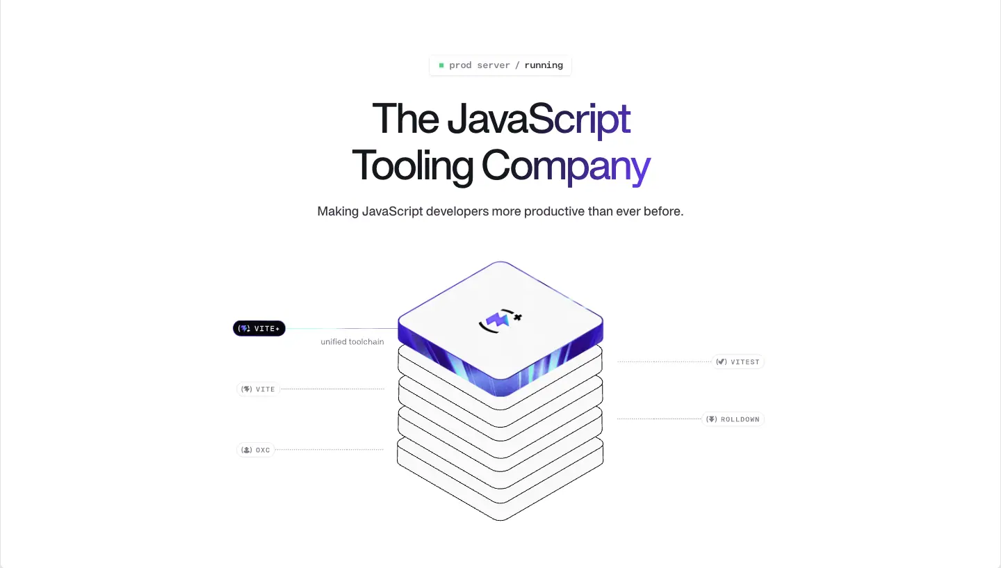
<canvas> 960×435 at x=240, Rive file 1280_x_552_homepage.riv (phone: 343_x_148_homepage_mobile.riv): an isometric stack of 7 white tiles, the top one a violet-edged glass tile with the VoidZero mark, connected by thin leader lines to mono pills VITE+, VITE, OXC, VITEST, ROLLDOWN |
| CTA |
none |
Why. There is no button because the site does not sell anything here: the products are free and live on their own domains. The hero's job is positioning ("the JavaScript tooling company") and the stack diagram answers "how do the five projects relate?" in one picture: they are layers of one toolchain, Vite+ on top. The status pill is a developer joke and a quiet claim of reliability.
H2 · About: dark, centered, mark-as-hero
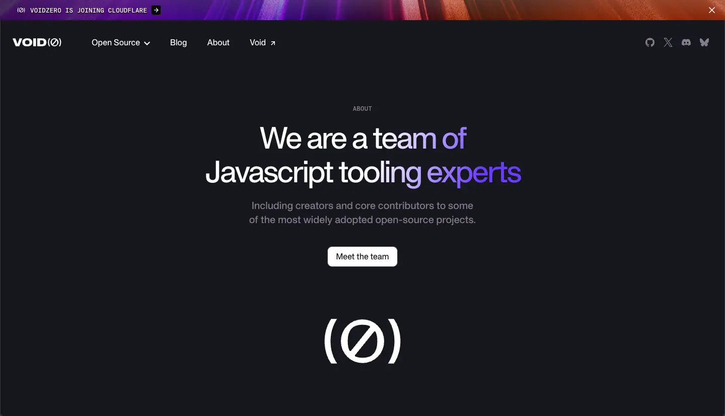
Dark band (#16171D), mono eyebrow ABOUT, H1 "We are a team of / Javascript tooling experts" in white shine (white → violet band), 18/28 gray subline, one white button "Meet the team" (radius 8, 16px 500), then the (Ø) mark drawn by about.riv on a 480×217 canvas. Height 698px.
Why. The about page is about people, so it opens on the brand mark only and pushes the team grid down; the shine headline repeats the home hero so the two pages feel like one system.
H3 · Blog index: featured split
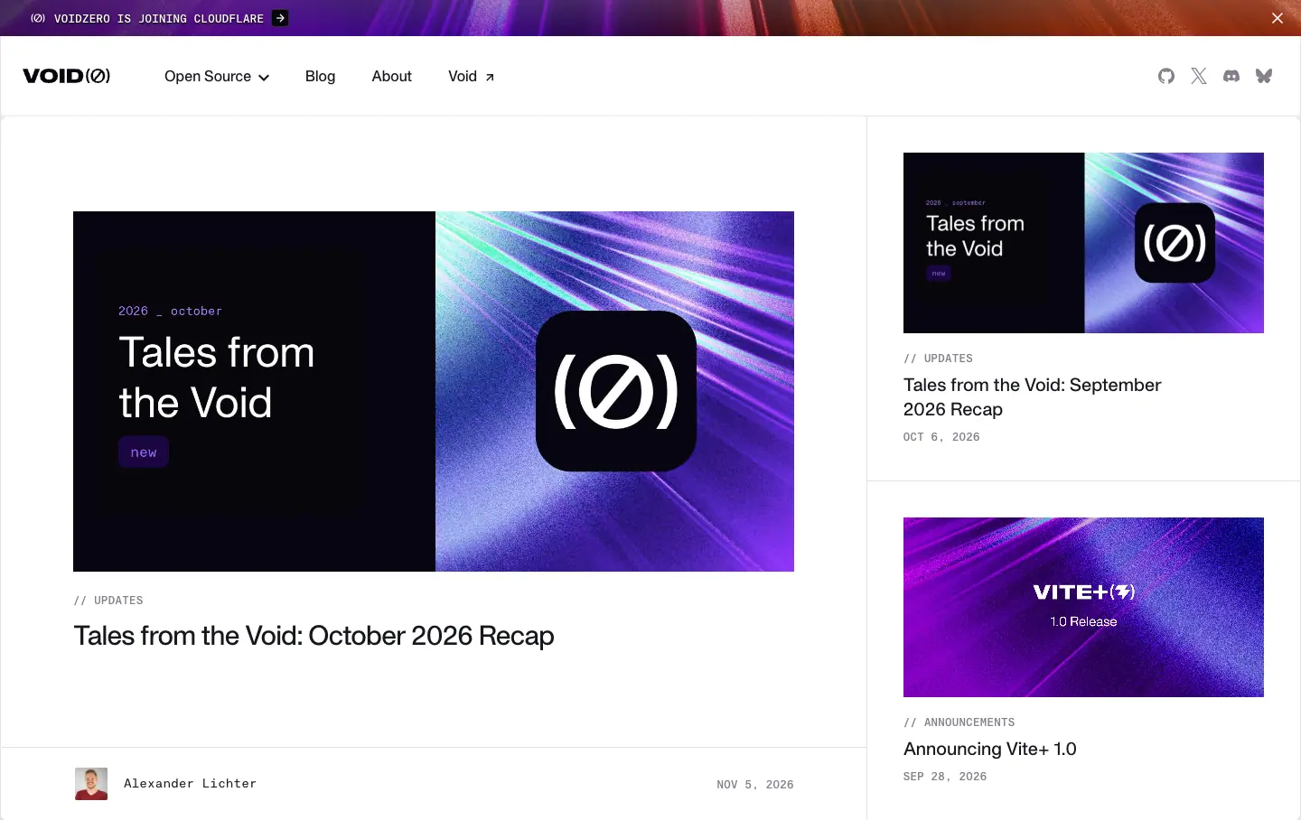
Two columns: the newest post as a large card on the left (cover ≈ 600×300, // UPDATES label, 30/37.5 title, author row with avatar and mono date), two smaller stacked cards on the right (cover + 20/27.5 title + mono date). 780px tall.
Why. Recaps ship monthly and announcements a few times a year. A featured split lets the newest item lead without designing a custom hero per post.
H4 · Post: title left, cover right
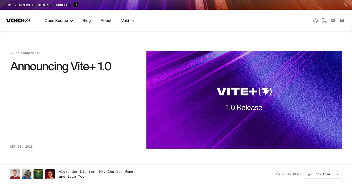
Left: mono category (// ANNOUNCEMENTS), H1 48/60 -2.4px, mono date pinned to the bottom. Right: the cover image at ≈ 600×300. Below a 1px rule: avatars + mono author names on the left, 5 MIN READ and a "Copy Link" split button on the right. 626px tall. Same for recaps and case studies.
Why. The cover carries the brand texture, so every post looks on-brand without a designer making a new layout. Reading time and copy-link are the two actions a developer wants before sharing.
H5 · Newsletter: grid-paper hero
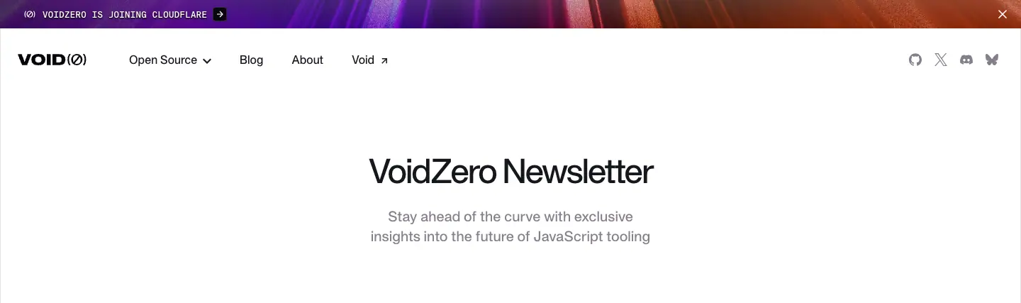
A .grid-background wrapper (fine square grid in #E5E4E7) with a centered H1 "VoidZero Newsletter" 48/67.2 -2.4px and an 18/28 gray two-line subline. 299px tall. Then a centered email field + black "Subscribe" button.
H6 · Legal: title + date, nothing else
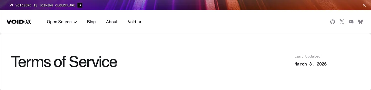
H1 "Terms of Service" 60/60 left, Last Updated / March 8, 2026 in mono on the right. 221px.
Pattern summary
| Hero |
Align |
Theme |
Visual |
CTA |
| Home |
center |
light |
Rive isometric stack |
none |
| About |
center |
dark |
Rive (Ø) mark |
1 white button |
| Blog |
split |
light |
post covers |
cards |
| Post |
split |
light |
cover JPG |
copy link |
| Newsletter |
center |
light, grid paper |
none |
email field |
| Legal |
split |
light |
none |
none |
06 · Section types
Sixteen section patterns across the site. Each one fills the 1440 ruled frame.
S1 · Announcement banner

40px full-bleed strip. Background: footer.C-44yuQw.jpg texture under a violet → magenta → orange 90° gradient and a dark left-to-right scrim. Text: KH Teka Mono 12/16.5, 500, uppercase, +0.3px, white, prefixed with a small icon and followed by a white arrow chip. Close × on the right; dismissal is stored in localStorage (banner-dismissed-voidzero-cloudflare) and applied before paint by an inline <script> so the banner never flashes. Why: one sentence of news (here: "VoidZero is joining Cloudflare") without adding a hero variant.
S2 · Logo marquee ("Trusted by the world's best software teams")

239px. Centered 18/28 line, then a horizontally scrolling row of grayscale logos in 94×94 boxes on a 174px pitch (Shopify, OpenAI, Framer, Linear, Hugging Face, Cloudflare, Mercedes, repeated). Animation scroll-horizontal (linear, infinite, distance computed from item width × gap × count). The middle logo is framed by big thin parentheses ( … ) that read as (Ø). Why: brand-mark parentheses turn a generic logo wall into a brand moment.
S3 · Section label bar
63px strip with a mono label (OSS) at 20px/40px left padding, ruled top and bottom. Why: a chapter marker, like a file tab.
S4 · Section intro (fixed height)
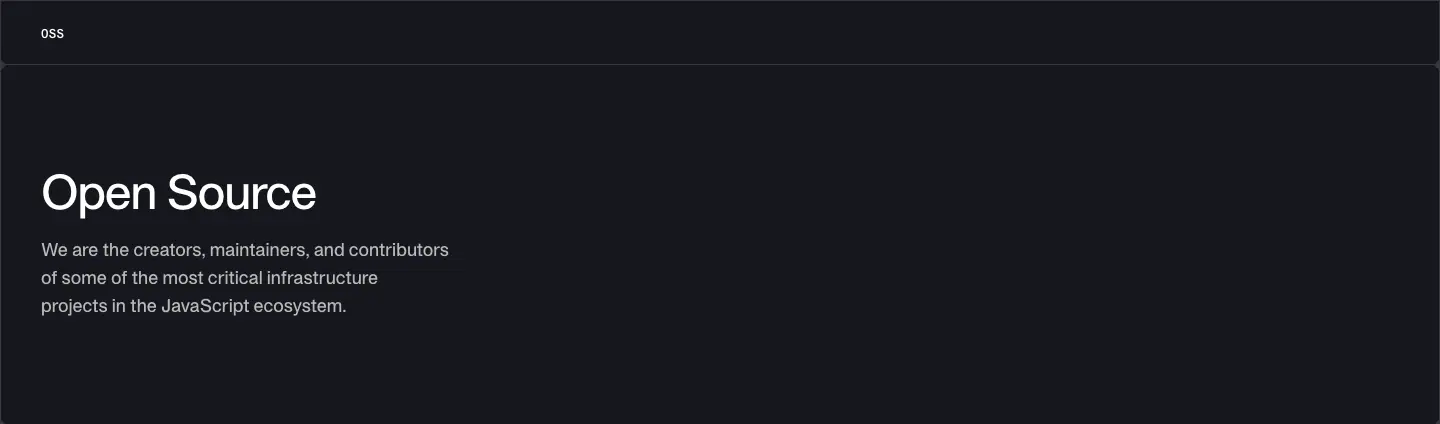
360px tall, H2 48/48 + 18/28 paragraph max ≈ 448px wide, left-aligned at x=41, vertically centered. Dark variant on the OSS block (#16171D, paragraph at 70% white).
S5 · Product tab rail + texture rows (signature section)
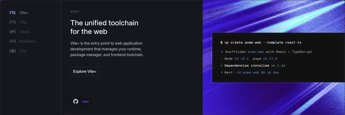
2,514px tall on the dark band. Three columns:
1. Sticky rail (253px column, list at x=41, 172px wide): five items, each a 16/24 label with the product's bracket icon. The item for the row in view is white; the rest are #867E8E. It works as a scroll-spy table of contents.
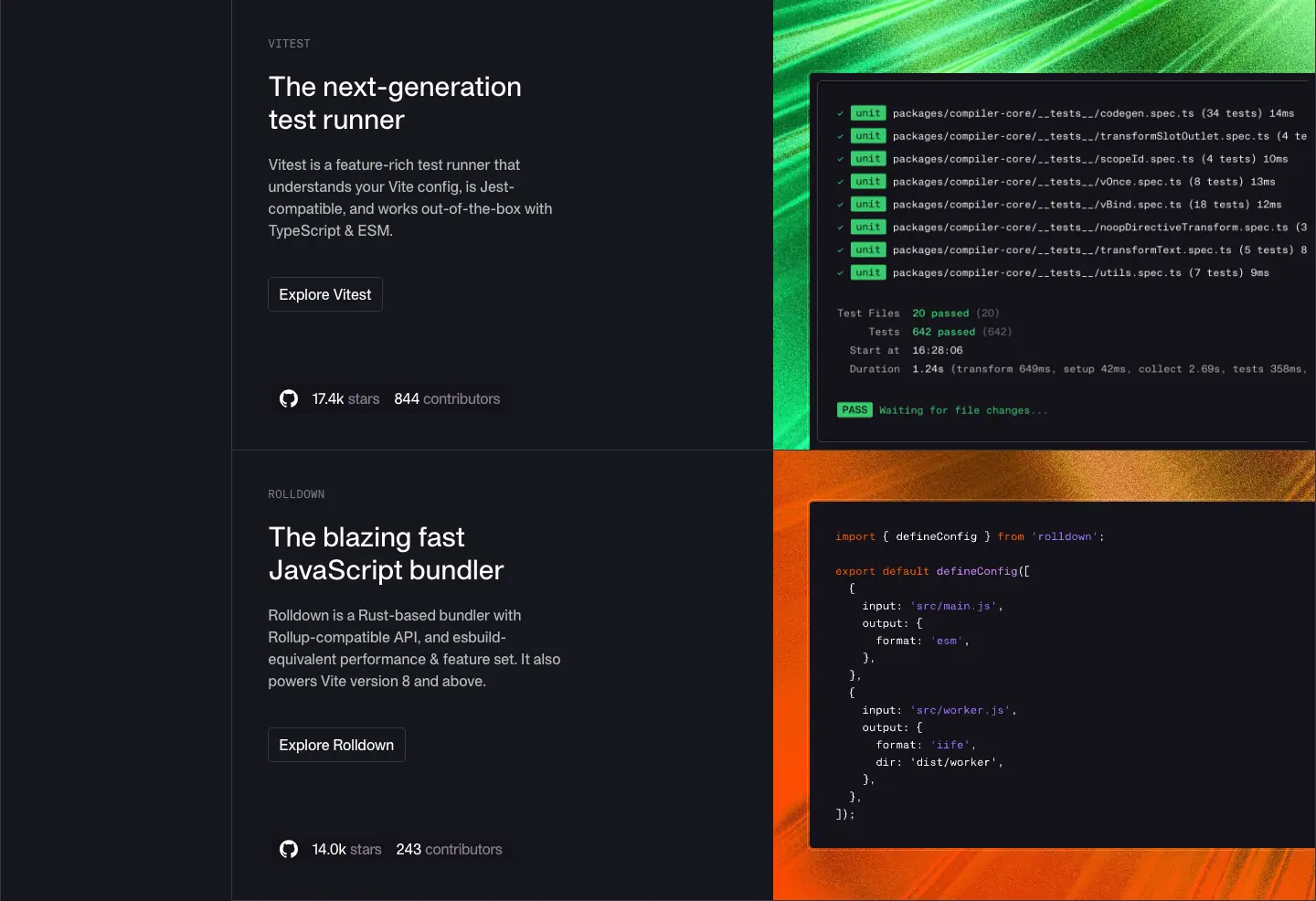
2. Text column (593px): mono product label (VITE+), H4 30/36, paragraph 16/24 at 70% white, outline button Explore <product> (radius 4, padding 6px 12px, 16px 500), then a GitHub chip: icon + 83.9k stars + 1,390 contributors.
3. Texture panel (593px wide, 480–553px tall): the product's light-streak JPG as background-size: cover, with a terminal/code PNG or SVG inset at x=894 (48px from the panel edge), bleeding off the right side.
Why: five products compete for attention. The rail says "there are five, here is where you are", and the per-product color makes each row unmistakable while the identical structure says "one family".
S6 · Statement header
192px, H3 40/53.3 two lines, left. "Trusted by millions of developers around the world". Introduces the stats.
S7 · Stats chart (bento, 2-up)
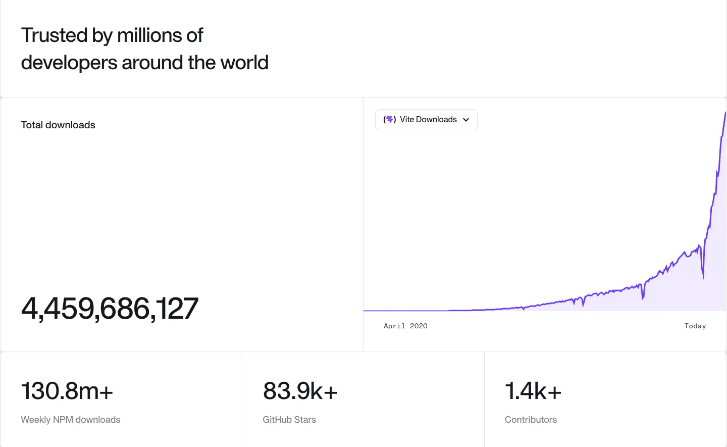
504px, two cells divided by a 1px rule. Left: label "Total downloads" (20/28 500) top, giant number 4,459,686,127 (60px, <number-flow-vue>) bottom-left. Right: a <canvas> area chart (718×503) of downloads since April 2020, line #6C3BFF with a pale violet fill, a dropdown chip "Vite Downloads" to switch project, mono axis labels April 2020 / Today.
S8 · Stat tiles (bento, 3-up)
189px, three equal cells: a small + glyph, number 48/48 (130.8m+, 83.9k+, 1.4k+), caption 18/28 gray. Numbers animate with Number Flow.
Why S7 + S8: one hero metric with a chart, then three supporting metrics. It is a bento without rounded cards: the ruled frame provides the cells.
S9 · Mission band
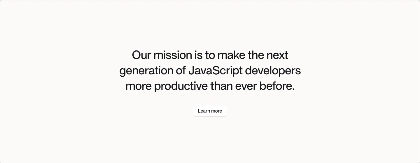
#FBFAF7 warm off-white, padding 160px 40px, centered H3 40/53.3 over 3 lines, white "Learn more" button. Why: a change of paper color marks a change of tone from proof to purpose.
S10 · Investors strip
74px row (home) / 360px + logo grid + angel list (about). Home: "Backed by the very best in the dev tools space." left, then 4 logo cells (Accel, Peak XV, Sunflower Capital, Amplify). About: 2×2 big logo grid + a 4-column list of angels with mono uppercase affiliations.
S11 · Featured resources carousel
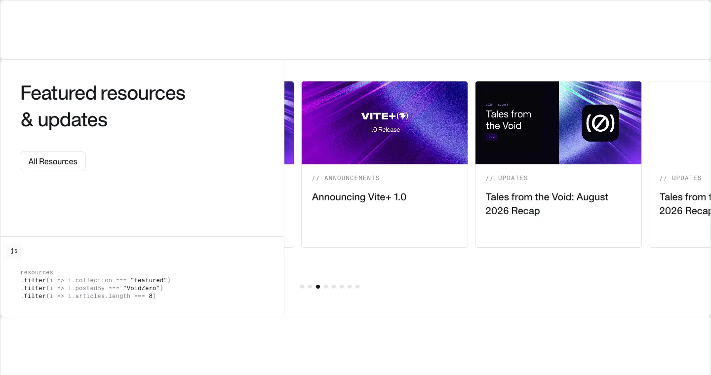
520px, 10-col grid. Left 4/10: H3 "Featured resources & updates", white "All Resources" button, and a mono code block captioned js:
resources
.filter(i => i.collection === "featured")
.filter(i => i.postedBy === "VoidZero")
.filter(i => i.articles.length === 8)
Right 6/10: a slide carousel (vue3-carousel: vc-marquee, --vc-transition-*) of 336×336 cards (cover 336×168, mono // UPDATES, 20/28 title), radius 4px, 1px stroke, dots below. Why: the code caption tells you how the list is chosen, in the readers' language.
S12 · Spacer
120px empty ruled box between groups. Why: breathing room that still shows the frame, so whitespace looks intentional.
S13 · ASCII-art band (about)
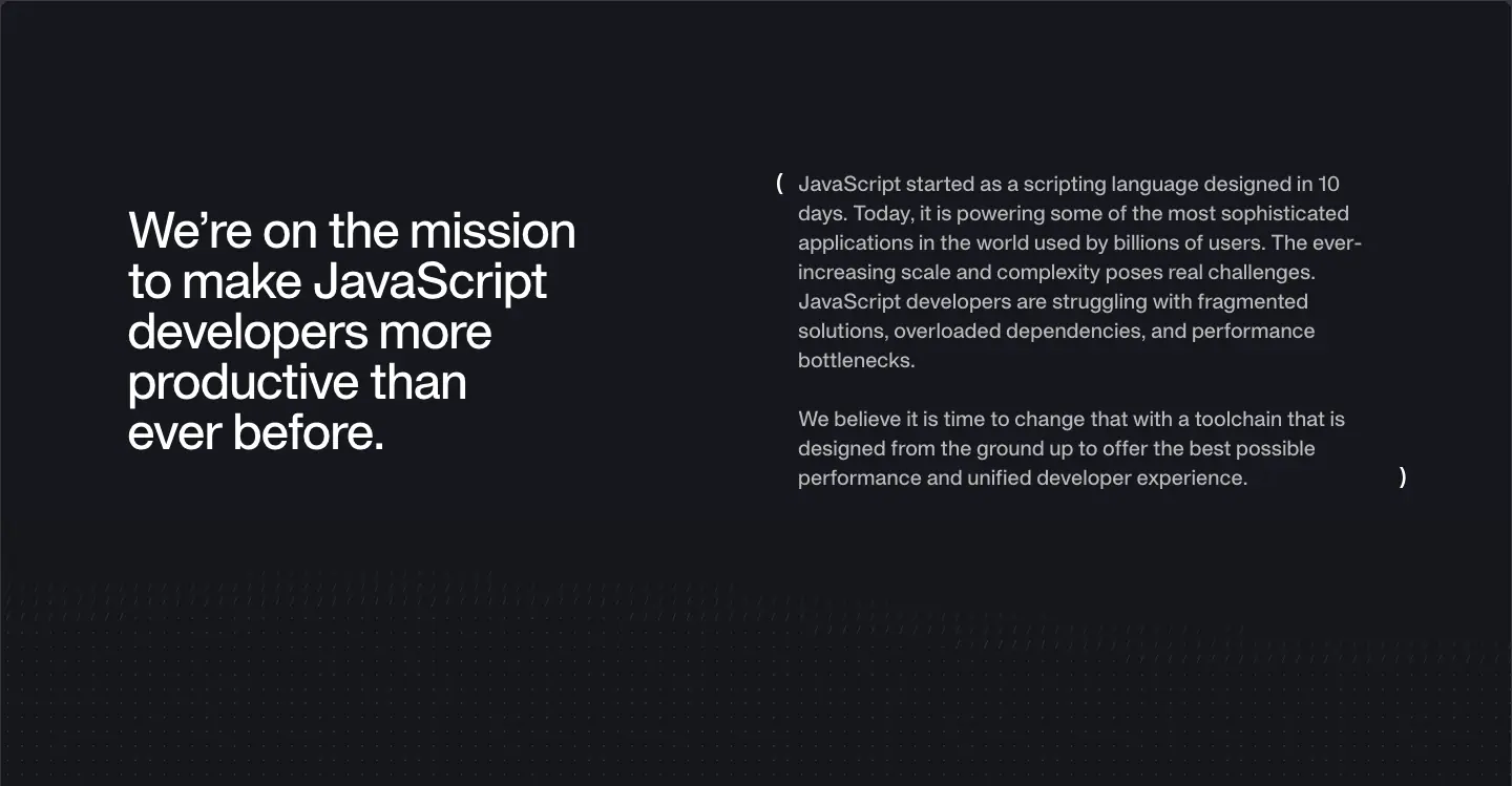
749px dark band, ascii-bg: a field of faint characters behind a split layout: H2 48/48 white mission statement left, a paragraph in big typographic parentheses ( … ) right. Why: texture made from text is on-brand for a tools company and stays legible.
S14 · Team grid
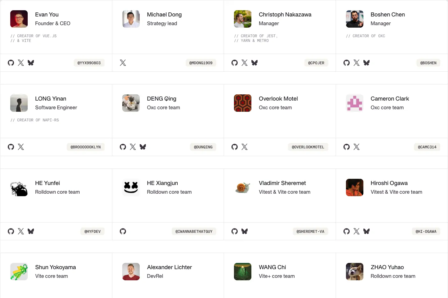
4 columns of beige (#F4F3EC) cells, each: 48px avatar, name 18/28 500, role 16/24 #3B3440, optional mono // CREATOR OF … credit, social icons + mono handle chip at the bottom. 21 people.
S15 · Hiring split
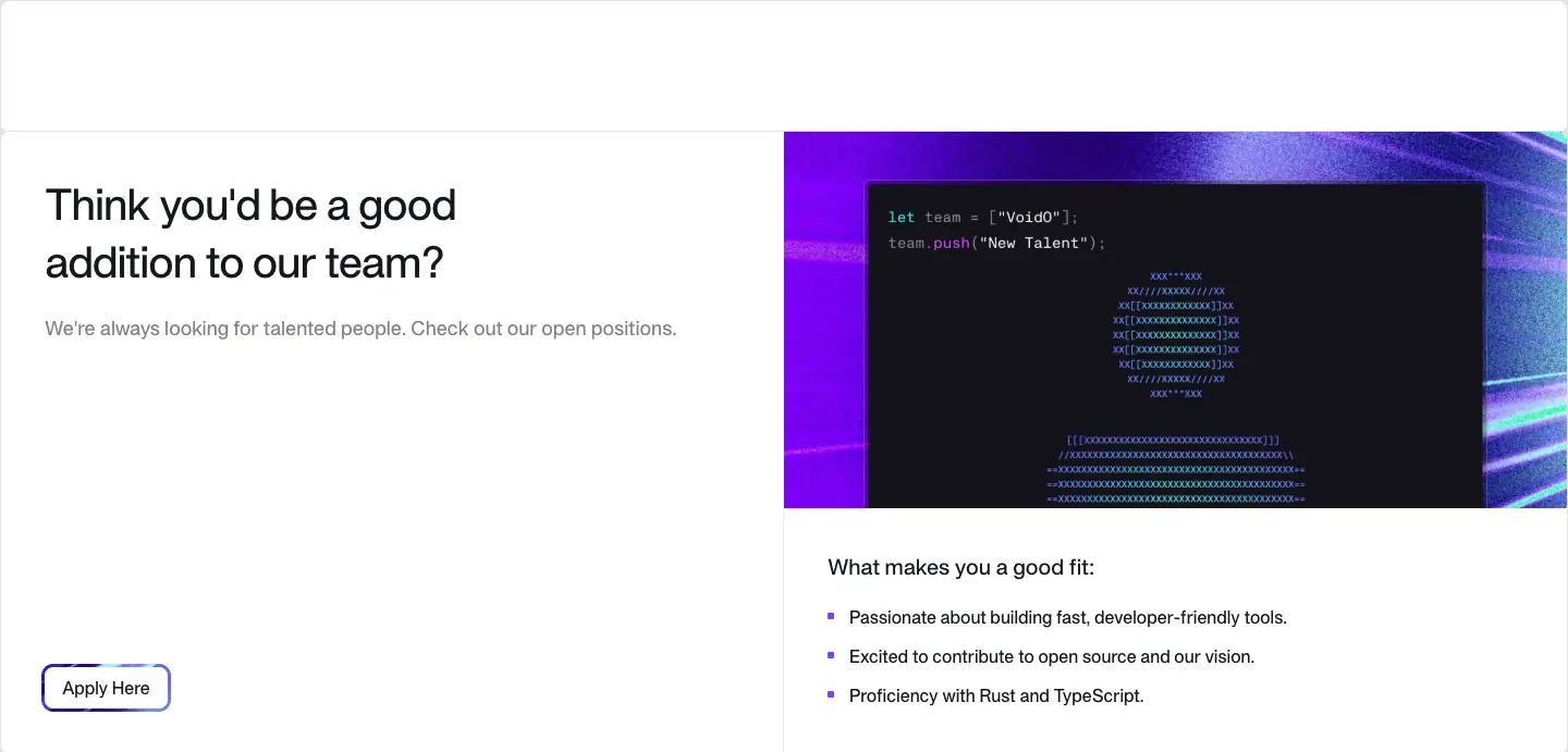
Left: H3 "Think you'd be a good addition to our team?", gray line, primary gradient-ring button "Apply Here". Right: a texture panel with a terminal snippet (let team = ["VoidZero"]; team.push("New Talent");) and an ASCII rocket, then a bullet list of fit criteria.
S16 · Footer CTA + glow band + link columns
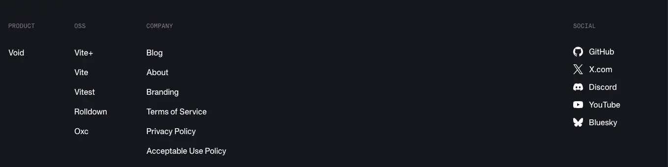
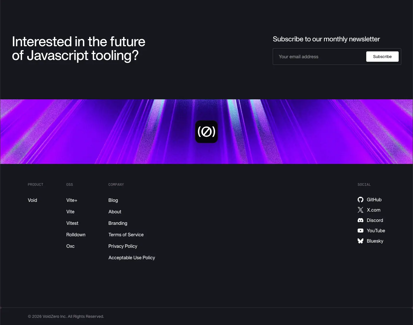
See shared header and footer. 1,132px dark block: H2 "Interested in the future of Javascript tooling?" + newsletter field, then a 220px violet light-streak band with the (Ø) app-icon tile centered, then 4 link columns + social list, then copyright.
Section frequency
| Pattern |
Pages using it |
| Banner, header, footer (S1, S16) |
all 11 captured |
| Spacer (S12) |
9 of 11 |
| Post hero + related + subscribe |
4 post templates |
| Product rail (S5) |
home only |
| Team grid, ASCII band, hiring |
about only |
07 · Copywriting and voice
Voice in four words
Plain, confident, technical, wry. Short declarative sentences, superlatives backed by numbers, and in-jokes that only JavaScript developers get.
Headline formulas (measured on the site)
| Formula |
Examples |
Why it works |
| Category claim |
"The JavaScript Tooling Company" |
Owns the category with a definite article. Three words, no verb. |
| "The ___ for the ___" |
"The unified toolchain for the web", "The build tool for the web" |
One noun phrase per product, same shape across five products, easy to scan in the rail. |
| Superlative + noun |
"The blazing fast JavaScript bundler", "The fastest JavaScript language toolchain", "The next-generation test runner" |
Speed is the product's main value, so it is in the title. |
| We are / We're on |
"We are a team of Javascript tooling experts", "We're on the mission to make JavaScript developers more productive than ever before." |
First person, plural, warm. |
| Question CTA |
"Interested in the future of Javascript tooling?", "Think you'd be a good addition to our team?" |
Invites without pushing; no "Sign up now". |
| Proof statement |
"Trusted by millions of developers around the world", "Backed by the very best in the dev tools space." |
Sets up numbers or logos directly below. |
Note the inconsistent capitalisation of "Javascript" vs "JavaScript" across headings (both appear). Keep one if you copy the system.
Body copy
- 1–3 sentences per block. Product descriptions are 2 sentences, 25–35 words: what it is, then who uses it ("Vite is the default choice for single-page web applications and the foundation for fullstack frameworks like TanStack Start, Nuxt, SvelteKit and more.").
- Numbers carry claims: "esbuild-equivalent performance", "4,459,686,127", "130.8m+", "83.9k stars".
- Posts open with TL;DR: in bold.
Labels and microcopy
| Element |
Pattern |
Example |
| Eyebrow |
// CATEGORY uppercase mono |
// UPDATES, // ANNOUNCEMENTS, // CUSTOMERS |
| Credit |
// CREATOR OF X |
// CREATOR OF VUE.JS // & VITE |
| Product label |
uppercase mono name |
VITE+, ROLLDOWN |
| Status |
terminal phrase |
prod server / running |
| Buttons |
verb + object |
Explore Vite+, Meet the team, Apply Here, All Resources, Learn more, Subscribe |
| Filter chips |
category nouns |
All, Announcements, Customers, Ecosystem, Updates |
| Code caption |
real JS |
.filter(i => i.collection === "featured") |
Naming
- Brand:
VOID(Ø) / (Ø), from void(0), the JavaScript expression that returns undefined.
- Changelog series: "Tales from the Void: Recap". 18 recap posts in the feed, monthly since July 2025 (two are special issues: ViteConf 2025 and the March 2026 launch week).
- Post titles: "Announcing " for launches (Vite+ 1.0, Rolldown 1.0, Oxfmt alpha), "How using " for case studies ("How Framer reduced LCP using Rolldown", "How PLAID Cut Build Times by 97%…").
Why this voice
Developers skip adjectives and read numbers. A short claim + a number + a working link to the repo is the most credible format for them. The // and void(0) jokes create in-group recognition at zero cost in clarity.
Copy checklist to reuse
- Category claim in ≤4 words for the H1.
- Same noun-phrase shape for every product title.
- One number per claim.
- Eyebrows as code comments.
- CTAs are verbs, never "Get started" on an open-source page.
08 · Components
Header

| Part |
Measured |
| Height |
88px, px-6 py-5 lg:py-7, transparent background, position: relative (it scrolls away; it is not sticky) |
| Logo |
VOID(Ø) wordmark, inline SVG data-URI, 97×16 at x=25 |
| Links |
"Open Source ▾" (dropdown), "Blog", "About", "Void ↗" (external to void.cloud): 16/24, 400, #16171D, 40px apart |
| Right |
4 icon links (GitHub, X, Discord, Bluesky), 32×32 hit boxes, 4px gaps |
| Phone |
logo + hamburger only |
Buttons (four kinds)
| Kind |
Look |
Measured |
Used for |
White .button |
white fill, #16171D text, 1px outline |
radius 8px, padding 8px 16px, 16px 500, h 38–40 |
"Learn more", "All Resources", "Meet the team", chart dropdown |
Outline small .button--sm on dark |
transparent, white text, 1px #3B3440 outline |
radius 4px, padding 6px 12px, h 36 |
"Explore Vite+" ×5 |
Primary gradient ring .button--primary |
dark (or white) pill inside a 3px ring cut from a moving texture JPG |
:before inset -3px, radius calc(.5rem + 3px), background-size 150%, move-background 16s; :after the inner fill radius 8px |
"Apply Here" |
| Black |
#16171D fill, white text |
radius 4px ≈, 14px 500 |
"Subscribe" on light |
Hover (all, @media (hover:hover)):
- .button:hover → scale: 105% + 0 4px 6px -1px #0000001a, 0 2px 4px -2px #0000001a shadow.
- Dark .button:hover → background flips to white, text to #16171D.
- Primary :hover:before → filter: brightness(130%), ring grows scaleX(1.0125) scaleY(1.025); :hover:after → inner fill shrinks scaleX(.98) scaleY(.96). Net effect: the ring brightens and thickens. Transitions .2s / .3s ease-in-out.
Status pill
Mono 14/20 500, prod server gray / running dark, with a pulsing 6px green square. 1px stroke, radius 4px.
Product rail item
Bracket product icon + 16/24 label. Inactive #867E8E, active #FFFFFF. Hover color → white ([role=tablist] … :hover). Sticky.
GitHub stat chip
GitHub mark + bold number + gray word: "83.9k stars 1,390 contributors". Sits on a faint white-10% pill.
Cards
| Card |
Size |
Anatomy |
Radius |
| Resource card (carousel) |
336×336 |
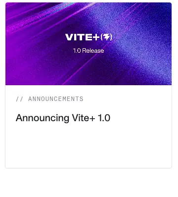
cover 336×168 → 16px padding → mono // LABEL 12/16 +1.2px → title 20/28 |
4px, 1px #E5E4E7 |
| Blog list row |
full width ≈ 1280×120 |
cover 260×130 ≈ · label + title 20/27.5 + avatars · mono date right |
0 (ruled rows) |
| Featured blog card |
≈ 600 wide |
cover · label · 30/37.5 title · author row |
0 |
| Team card |
≈ 360×200 |
avatar 48 · name · role · credit · socials · handle chip |
0, beige fill |
| Stat tile |
480×189 |
+ · number 48 · caption |
0 (ruled) |
Hover on cards: transition: all .15s with Tailwind group-hover: utilities (scale-105 on the cover image, translate-x-1 on arrows, border to white/50 on dark cards).
Chips and filters

Blog categories: mono // CATEGORIES label then text chips 14/20 500 capitalized, 1px stroke, radius 4px; the active chip ("All") has a violet outline. A search field sits right ("Search…"), 1px stroke.
Inputs
| Field |
Measured |
| Footer email (dark) |
325×56, transparent, white 16px text, padding 16px 20px, sits in a 1px white/20% box with the white "Subscribe" button inset |
| Newsletter page |
centered ≈ 300px field + black button |
| Placeholder color |
var(--vp-c-text-3) |

Code and terminal blocks
- Marketing inline code: KH Teka Mono 16px,
#110033, 1px #E5E4E7 outline, radius 4, padding 2×6.
- Post inline code: 15.75px 600,
#6C3BFF on rgba(142,150,170,.14).
- Post code block: VitePress Shiki,
--vp-code-line-height 1.7, --vp-code-font-size .875em, bg #F6F6F7, language tag top-right.
- Terminal art (images): dark
#16171D-ish window, 1px lighter border, mono 12–13px, ANSI greens/violets.
Post furniture
- Sticky TOC (left column, 16/24.9
#867E8E, active item #16171D with a 1px left bar).
- Author row: overlapping 32px avatars + mono names.
5 MIN READ with clock icon + "Copy Link" split button (chevron opens share options).- Tables: 14/21, 1px rules, header in gray 600.
- Related posts + "Subscribe to our monthly newsletter" block at the end.
Carousel
vue3-carousel with is-effect-slide, dot pagination (8 dots, active = darker), cards bleed past the rail because the wrapper clips horizontally.
Footer
See shared header and footer.
09 · Art direction
The look in one sentence
A clean engineering drawing interrupted by bursts of long-exposure light. White paper, hairline rules and mono labels on one side; grainy, saturated light streaks, glass tiles and terminal windows on the other.
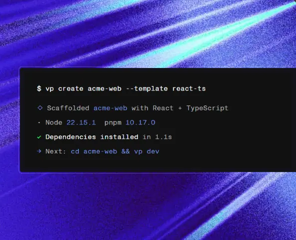
1. Light-streak textures (the main graphic)
| Product |
Hue family |
File (shipped) |
Inset |
| Vite+ |
violet / indigo with cyan glints |
viteplus.QG_kyPcM.jpg |
vp create terminal (viteplus.DWFNSSex.png) |
| Vite |
violet → magenta |
vite.DJccTzmn.jpg |
dev-server terminal (vite.5rp3iChU.svg) |
| Vitest |
acid green (#22FF73 family) |
vitest.Ct_DRQC5.jpg |
test run output (vitest.C33Vbobj.png) |
| Rolldown |
orange / amber |
rolldown.CyuqNomQ.jpg |
defineConfig code (rolldown.t16gwCnK.svg) |
| Oxc |
cyan / aqua (#32F3E9 family) |
oxc.BLpAMw8X.jpg |
Rive isometric stack of /parser … /formatter tiles |
| Footer / banner |
violet with white rays |
footer.C-44yuQw.jpg |
(Ø) app tile |
How they look. Diagonal bands of light at ≈ 20–35°, motion-blurred, with heavy film grain/noise, deep shadows in the corners and blown highlights along one streak. Think long-exposure photograph of light through glass, or a WebGL "light speed" shader frozen in time.
Why. Speed is the promise. Streaks are the universal visual shorthand for velocity. The grain keeps the images from looking like stock gradients and gives them a print/analog feel that contrasts with the crisp UI. One hue per product makes the family legible: the same technique, five colors.
How to make one. In Figma or Photoshop: a dark base; 3–6 long rotated rectangles in the product hue with Gaussian + motion blur; one white-hot streak at 60–80% opacity; Overlay a layer of monochrome noise at 15–25%; add a radial dark vignette. Or render a ray-march / light-tunnel shader and export a still at 2× (593×553 displayed → export ≥1186×1106).
2. Isometric glass stacks
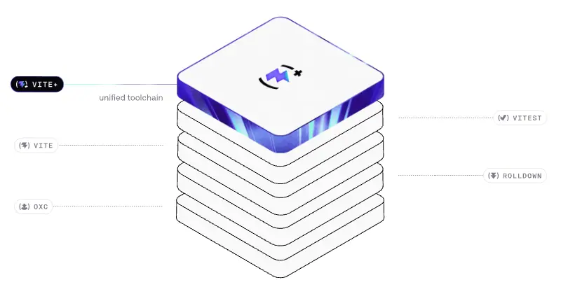
The home hero and the Oxc row use isometric stacks of rounded square tiles: white outlined tiles with a thin dark stroke (hero) or solid black tiles with mono labels on their sides (Oxc). The top tile is a glossy glass slab with a violet/cyan rim light and the product mark etched on it. Thin leader lines connect the stack to mono pill labels.
Why. "Layers of a toolchain" made literal. Isometric drawing is the classic language of system diagrams, so it reads as architecture, not decoration.
Made with. Rive (.riv), so the stack can hover, glow and respond. The static look can be built in Spline or Blender (orthographic camera at 35.264° / 45°), or drawn as an isometric SVG in Figma.
3. Terminal and code as illustration
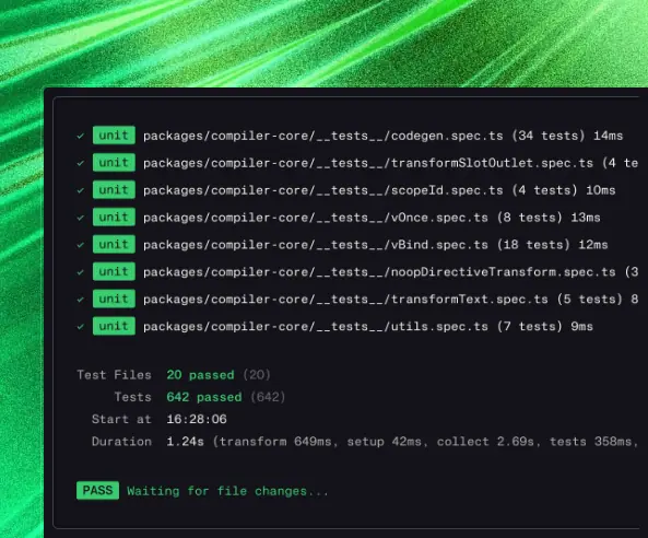
Product art is not mock UI; it is real-looking CLI output in a dark window: VITE v7.1.5 ready in 159 ms, Test Files 20 passed (20), green unit badges. Why: it is the screen the audience lives in. It needs no explanation.
4. ASCII and text textures
/about uses an ascii-bg band (faint character field) and an ASCII rocket inside the hiring terminal. Why: texture made from characters is native to developers and stays quiet behind text.
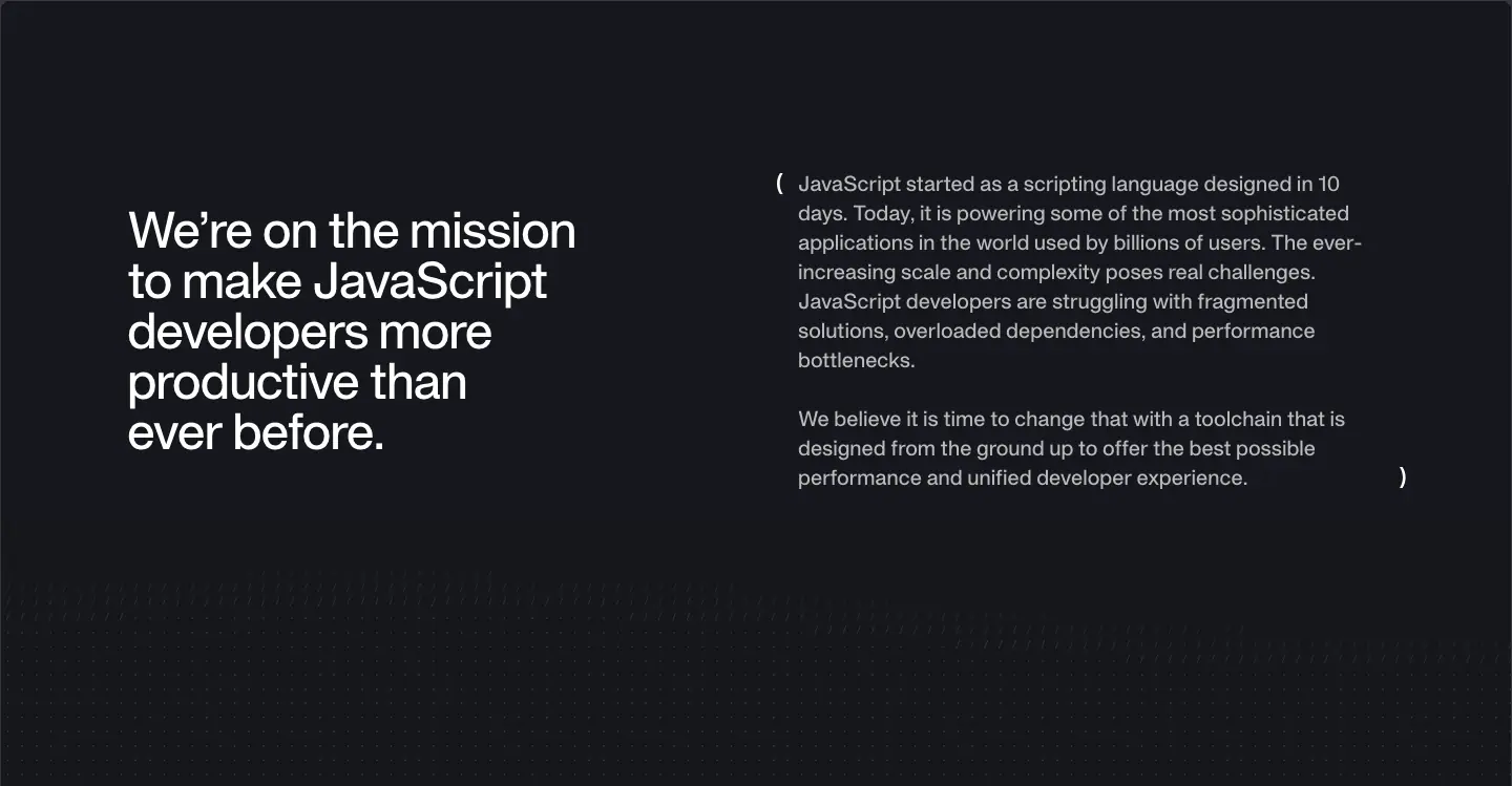
5. Grid paper
/newsletter and parts of the blog use .grid-background: a fine square grid in the stroke color. It repeats the blueprint idea at a smaller scale.

6. Logo and mark


- Wordmark:
VOID(Ø): heavy, wide, all-caps geometric letters, then a slashed zero in parentheses. Rendered at 97×16 in the header.
- Mark:
(Ø) alone; also shown as a black rounded-square app tile with a soft inner glow (footer band, recap covers).
- Product marks: each sub-brand puts its own glyph inside brackets:
(⚡︎) style for Vite+, and the brand kit ships *-icon-color-bracketless variants without the brackets.
- Usage seen on site: wordmark always dark on light or white on dark, never on a texture; the app tile is the only form placed on textures.
7. Post covers
Two systems:
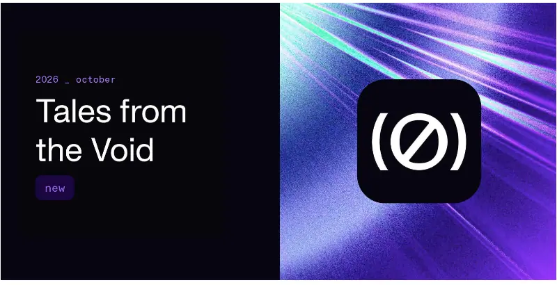
- Recap cover: left half black with a mono 2026 _ october tag, a two-line title "Tales from the Void", a small violet new chip; right half a violet streak texture with the (Ø) app tile.
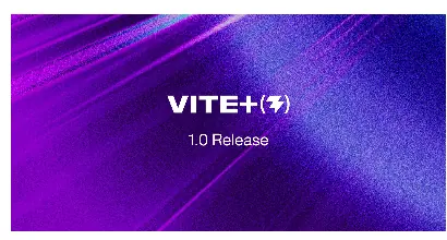
- Launch cover: full-bleed product texture with the product wordmark + bracket glyph centered and a one-line subtitle ("1.0 Release", "Beta Release").
- Partner/case cover: a soft violet abstract with "Framer + void(Ø)" lockup; or white with "VOID(Ø) + Cloudflare".
Why. Templates let any engineer publish a post that looks designed. The recap cover changes only its date tag.
8. Photography
None, except member avatars (a mix of photos, pixel art and illustrations, all user-chosen). Why: the team is open-source maintainers whose public identity is their GitHub avatar; using those keeps the page honest.
9. Customer and investor logos
Monochrome gray marks, object-fit: contain in square 94px cells (customers) or 25px-high cells (investors). Never in color. Why: color logos would fight the product textures.
Art direction rules (derived)
- UI is monochrome. Color lives only in raster textures and the violet accent.
- Every texture gets one product hue, grain, and a diagonal streak.
- A real artefact (terminal, config, logo tile) sits on every texture.
- Isometric for systems, flat for UI.
- No stock photography, no 3D characters, no emoji.
10 · Brand assets and graphics inventory
Official brand kit
The footer link Branding points to /branding, which currently renders an empty page (header + footer only, 1,260px tall). The real kit is on GitHub:
github.com/voidzero-dev/community-design-resources · licence CC BY-NC-SA 4.0 for the artwork; product names and logos are trademarks and are excluded from the CC licence ("Non-commercial community use is welcome, but trademarks may not be used in commercial, promotional, or misleading ways").
| Folder |
Files |
Variants |
brand-assets/voidzero/ |
5 |
logo-light, logo-dark, icon-light, icon-dark, black-bg |
brand-assets/vite+/, vite/, vitest/, rolldown/, oxc/ |
9 each |
logo × {color, mono} × {light, dark}, icon × {color, mono} × {light, dark}, icon-color-bracketless |
mobile-wallpapers/ |
7 JPG |
one per product + voidZero + collection.jpg |
All logos ship as SVG. This research does not copy them; it links to the repo. The wallpaper collection is reproduced below as a reference for the texture style:
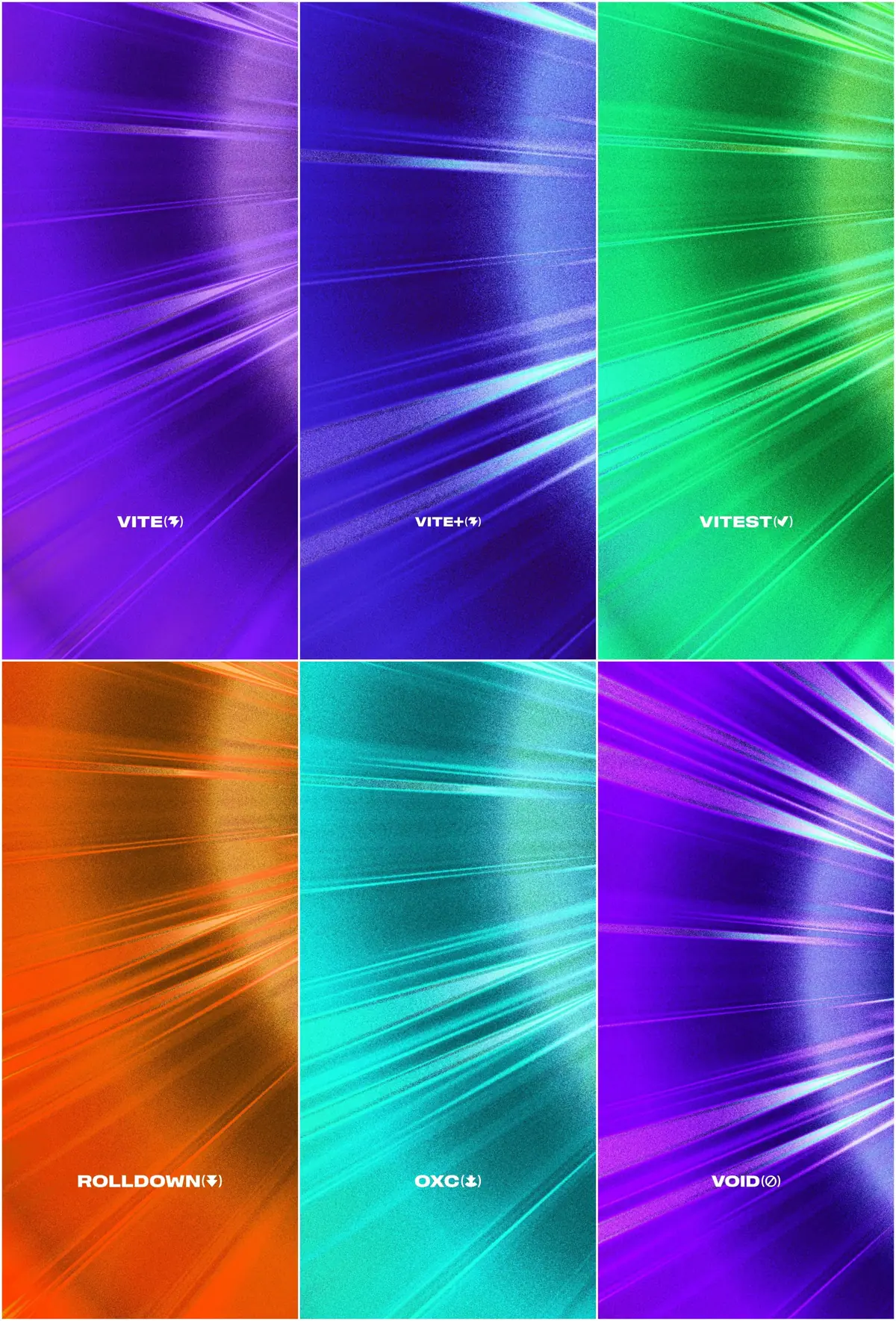
The variant matrix to copy: every product has logo (glyph + name) and icon (glyph only), each in color and mono, each for light and dark backgrounds, plus a bracketless icon for tight spaces. That is 9 files per product, and it covers every surface a community member needs.
Graphics inventory (what is on the site)
| # |
Asset type |
Example |
Format on site |
How to recreate |
| 1 |
Light-streak texture |
 |
JPG, background-size: cover |
Blurred rotated bands + noise overlay + vignette (09) |
| 2 |
Terminal / code inset |
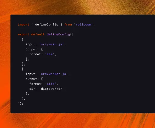 |
PNG/SVG image |
Real CLI output in a dark window, 12–13px mono, ANSI colors |
| 3 |
Isometric tile stack |
|
Rive .riv on <canvas> |
Rive / Spline / isometric Figma |
| 4 |
Oxc labelled stack |
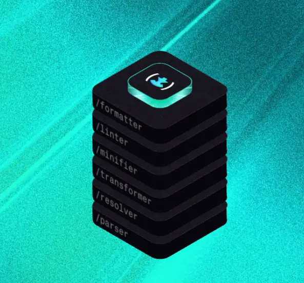 |
Rive |
Black isometric tiles with mono side labels |
| 5 |
(Ø) app tile |
 |
JPG band + mark |
Black rounded square, white mark, inner glow |
| 6 |
Shine headline |
|
CSS gradient text |
13 |
| 7 |
Gradient-ring button |
|
CSS :before with JPG |
13 |
| 8 |
Tick-mark frame |
|
CSS borders |
04 |
| 9 |
ASCII field |
|
CSS background |
Monospace characters at 5–10% opacity |
| 10 |
Grid paper |
|
CSS background |
linear-gradient lines every ≈ 24px |
| 11 |
Area chart |
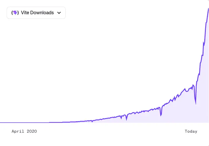 |
<canvas> |
1.5px #6C3BFF line, 10–15% violet fill, mono axis |
| 12 |
Recap cover |
|
JPG /covers/update-2026-oct.jpg |
Split black/texture template |
| 13 |
Launch cover |
|
JPG |
Texture + centered product wordmark |
| 14 |
Announcement band |
|
JPG + CSS gradient |
Texture + 90° violet→orange gradient + scrim |
| 15 |
Logo marquee |
 |
SVG logos, CSS animation |
Gray logos, ( ) frame on one |
| 16 |
Status pill |
|
HTML + CSS pulse |
6px green square, pulse 2s |
| 17 |
Team avatars |
 |
user images |
Use each person's GitHub avatar |
Icon style
- Social and UI icons: simple filled glyphs (GitHub, X, Discord, YouTube, Bluesky), 16–20px, single color (
#16171D or white).
- Product icons: the brand-kit glyphs, wrapped in brackets
( ) in labels and rails ((⚡︎) VITE+).
- UI glyphs: chevrons,
↗ for external links, + for stat tiles, a clock for read time, a link icon for copy-link.
- No duotone, no outlined illustration sets, no emoji.
Asset production checklist (to build a similar kit)
- Wordmark + mark (light, dark, mono, color).
- One texture per product at ≥2× display size, plus a 9:16 wallpaper crop.
- Cover templates: recap (date tag swap), launch (wordmark swap), partner (lockup).
- One isometric "system" illustration.
- Terminal snippets per product as images (or live HTML).
- Announcement band texture.
11 · Motion and interaction
All values come from the shipped CSS and getComputedStyle on the live page. Rive timelines are inside binary .riv files and are described from observation, not measured.
Defaults
| Token |
Value |
--default-transition-duration |
150ms |
--default-transition-timing-function = --ease-in-out |
cubic-bezier(.4, 0, .2, 1) |
--ease-out |
cubic-bezier(0, 0, .2, 1) |
--ease-in |
cubic-bezier(.4, 0, 1, 1) |
| Links, nav, cards |
transition: all/colors .15s cubic-bezier(.4,0,.2,1) (29 interactive elements on home) |
| Theme-ish color changes (docs layer) |
.25s color / .5s background-color |
Named animations
| Animation |
Where |
Duration / easing / repeat |
What it does |
shine |
Home H1 (dark text), About H1 (white text) |
5s ease-in-out, once, forwards |
Moves a 400%-wide gradient from background-position: 100% 0 to 35% 0. A violet band sweeps across the headline and parks on the last letters, so the ending state is part-violet. |
pulse |
6px green dot in the status pill |
2s cubic-bezier(.4,0,.6,1) infinite |
Opacity 1 → .5 → 1. "Server running". |
move-background |
Primary button ring (:before) |
16s ease-in-out infinite |
background-position 40% 40% → 60% 60% → 40% 40% on a 150%-sized texture: the ring's light drifts slowly. |
scroll-horizontal |
Customer logo strip |
linear infinite; distance = (item width + gap) × count |
Endless marquee. |
vc-marquee |
Carousel library |
var(--vc-marquee-duration) linear infinite |
Library marquee mode. |
fadeIn |
Lazy blocks (scoped data-v-09b43e16) |
.3s ease-out, .1s delay |
Opacity 0 → 1. |
shadowFadeIn |
Same component |
.3s ease-out |
Shadow grows from 0 25px 50px -20px #32325d1a to 0 50px 100px -20px #32325d40, 0 30px 60px -30px #0000004d. |
| Number Flow |
Stats (<number-flow-vue>) |
library default |
Digits roll to the final value when the tile enters the viewport. |
Rive scenes
| File |
Where |
Behaviour (observed) |
1280_x_552_homepage.riv / 343_x_148_homepage_mobile.riv |
Home hero |
Tile stack hovers; the glass top tile glows; leader lines connect to labels |
480_x_480_build_tool_for_web.riv, …_fastest_javascript_bundler.riv, …_language_toolchain.riv, …_next_generation_runner.riv |
Product rows |
Product scene per row (Oxc stack observed as a static frame in capture) |
about.riv / about-mobile.riv |
About hero |
(Ø) mark animation |
Loaded through @rive-app/canvas-lite with autoplay off by default and turned on per component. Canvas-lite is the smallest Rive runtime (no WebGL), chosen for page weight.
Hover physics
| Element |
Hover |
Timing |
.button (white) |
scale: 105% + small shadow |
150ms |
.button on dark |
fill flips to white, text to #16171D |
150ms |
.button--primary |
ring brightness(130%) and grows (scaleX 1.0125, scaleY 1.025); inner fill shrinks (scaleX .98, scaleY .96) |
.2s / .3s ease-in-out |
.stacked-blocks avatars |
translateY(-4px) and alternating rotate(±5deg) |
.2s |
| Card cover image |
group-hover:scale-105 |
150ms |
| Arrows |
group-hover:translate-x-1 (4px) |
150ms |
| Product rail item |
color → white |
150ms |
| Text links / icons |
hover:opacity-70/80/85 |
150ms |
Scroll behaviour
- Header scrolls away (not sticky).
- Product rail is
position: sticky and highlights the row in view.
- Post TOC is sticky and tracks the current heading.
html { scroll-behavior: smooth } inside one component; overflow-x: clip everywhere so motion never creates horizontal scroll.
Reduced motion
Two rules in the CSS:
1. Global: @media (prefers-reduced-motion: reduce) { *, :before, :after { transition-duration: 0s !important; animation-duration: 1ms !important; animation-iteration-count: 1 !important; scroll-behavior: auto !important } }
2. Component: transition-duration: .01ms; animation-duration: .01ms.
With reduced motion on, the shine headline jumps straight to its end state (violet tail visible), the pulse stops, and the marquee stops.
Why this motion
- Fast feedback (150ms) everywhere matches the "fast tooling" promise.
- One-shot shine draws the eye once, then leaves a static brand color in the headline; it does not loop and annoy.
- Living signals (pulse, drifting ring light) are slow and small, so they read as "alive" rather than "look at me".
- Interactive illustration in Rive gives rich motion with small files and no video.
What is not measurable here
- Rive timelines, easing and state-machine inputs.
- Number Flow internal timing (shadow DOM).
- Exact carousel slide duration (
--vc-transition-duration resolves at runtime).
12 · Glossary
Words to brief a designer or developer for a VoidZero-style site.
| Term |
Meaning here |
| Blueprint frame / ruled column |
A max-width column with visible 1px side borders and full-width 1px section rules |
| Tick marks |
5px CSS triangles where a horizontal rule meets a side rail |
| Rail |
The 1px vertical border on each side of the column |
| Spacer section |
An empty, ruled block (120px) used as deliberate whitespace |
| Section label bar |
A thin strip holding a mono chapter label (OSS) |
| Eyebrow |
Small label above a heading; here written as a code comment (// UPDATES) |
| Light-streak texture |
Grainy, motion-blurred diagonal light image in one hue |
| Grain / noise overlay |
Monochrome noise layered on an image for an analog feel |
| Inset artefact |
A terminal or code screenshot placed on a texture |
| Isometric stack |
Tiles drawn in isometric projection stacked like layers |
| Leader line |
A thin line linking a diagram part to its label |
| Shine text |
Text filled with a moving gradient via background-clip: text |
| Gradient ring button |
A button whose border is a moving texture image |
| Scroll-spy rail |
A sticky list that highlights the section in view |
| Bento (ruled) |
A grid of unequal cells separated by rules instead of rounded cards |
| Number Flow |
Animated digit-roll counter component |
| Marquee |
Infinite horizontal scroll of logos |
| Rive |
Tool + runtime for interactive vector animation (.riv files) |
| VitePress |
Vue-based static site generator; voidzero.dev runs on it |
| Tailwind v4 theme variables |
--color-*, --text-*, --radius-*, --spacing tokens in CSS |
text-wrap: balance |
Browser balances line lengths of multi-line headings |
| Grotesque |
Sans-serif family type with neutral, slightly quirky forms (APK Protocol) |
| Mono |
Monospaced font (KH Teka Mono) |
| Tracking |
Letter-spacing; negative at display sizes |
| App tile |
The brand mark inside a rounded square, like an app icon |
| Bracketless icon |
A product glyph without the surrounding ( ) |
| Recap |
Monthly changelog-style post ("Tales from the Void") |
| Cover template |
Fixed layout for post covers where only text/texture swaps |
| Scrim |
A translucent dark gradient laid over an image to make text readable |
A one-paragraph brief
Build a light developer-tools marketing site in a 1440px ruled column with 1px side rails, full-width section rules and 5px tick marks. Use one medium-weight grotesque for all text (60/67 H1 at -0.05em, 48/48 H2, 18/28 body) and a mono for //-style uppercase eyebrows, dates and code. Keep UI monochrome (#16171D, #867E8E, #E5E4E7 on white) with one violet accent #6C3BFF for links and a one-shot shine on the hero headline. Put all color in grainy light-streak textures, one hue per product, each with a real terminal screenshot inset. Use a dark band for the product section with a sticky scroll-spy rail. Hover feedback 150ms ease-in-out, scale 105% on buttons. Square-ish corners (4–8px).
13 · Build recipe
Tokens copied from voidzero.dev's CSS, then minimal code for the signature pieces. Swap the commercial fonts for the free substitutes in 03.
Tokens
:root {
  /* color */
  --color-white: #ffffff;
  --color-primary: #16171d;   /* text on light, dark bands */
  --color-grey: #867e8e;      /* labels, short marketing copy */
  --color-nickel: #3b3440;    /* long-form body, dark-band borders */
  --color-stroke: #e5e4e7;    /* every rule */
  --color-beige: #f4f3ec;     /* card fills */
  --color-paper: #fbfaf7;     /* mission band */
  --color-slate: #14121a;     /* product panels */
  --color-brand: #6c3bff;     /* electric violet: links, shine, chart */
  --color-vite: #b39aff;
  --color-zest: #22ff73;
  --color-aqua: #32f3e9;
  --color-status: #00b442;

  /* type */
  --font-sans: "APK Protocol", "Inter Display", sans-serif;
  --font-mono: "KH Teka Mono", "JetBrains Mono", monospace;
  --text-h1: 60px;  --lh-h1: 67.2px; --tr-h1: -0.05em;
  --text-h2: 48px;  --lh-h2: 48px;   --tr-h2: -0.025em;
  --text-h3: 40px;  --lh-h3: 53.33px;
  --text-h4: 30px;  --lh-h4: 36px;
  --text-body: 18px; --lh-body: 28px;
  --text-label: 12px; --lh-label: 16px;

  /* layout */
  --frame: 1440px;
  --spacing: 4px;
  --pad-x: 40px;
  --spacer: 120px;
  --radius-sm: 4px; --radius-lg: 8px;

  /* motion */
  --dur: 150ms;
  --ease: cubic-bezier(.4, 0, .2, 1);
}
Frame with ticks
.wrapper { max-width: var(--frame); margin-inline: auto; position: relative;
  border-inline: 1px solid var(--color-stroke); overflow-x: clip; }
.wrapper + .wrapper { border-top: 1px solid var(--color-stroke); }
.ticks::before, .ticks::after { content: ""; position: absolute; top: -5px; width: 0; height: 0;
  border: 5px solid transparent; }
.ticks::before { left: 0;  border-left-color: var(--color-stroke); }
.ticks::after  { right: 0; border-right-color: var(--color-stroke); }
.dark .wrapper, .dark .ticks::before, .dark .ticks::after { border-color: #3b3440; }
.spacer { height: var(--spacer); }
@media (width < 768px) { .wrapper { border-inline: 0; } }
Shine headline
.shine {
  background: linear-gradient(110deg, var(--color-primary) 0 40%, var(--color-brand) 48% 52%, var(--color-primary) 60% 100%);
  background-size: 400% 100%; background-position: 100% 0;
  -webkit-background-clip: text; background-clip: text; -webkit-text-fill-color: transparent;
  animation: shine 5s ease-in-out forwards;
}
@keyframes shine { to { background-position: 35% 0; } }
Buttons
.button { display:inline-flex; align-items:center; gap:8px; padding:8px 16px; border-radius:8px;
  background:#fff; color:var(--color-primary); font:500 16px/22.4px var(--font-sans);
  outline:1px solid var(--color-stroke); transition: all var(--dur) var(--ease); }
@media (hover:hover) { .button:hover { scale:1.05;
  box-shadow:0 4px 6px -1px #0000001a, 0 2px 4px -2px #0000001a; } }
.button--sm { padding:6px 12px; border-radius:4px; }
.dark .button { background:transparent; color:#fff; outline-color:#3b3440; }
.dark .button:hover { background:#fff; color:var(--color-primary); }

/* primary: texture ring */
.button--primary { position:relative; isolation:isolate; color:#fff; background:transparent; outline:0; }
.button--primary::before { content:""; position:absolute; inset:-3px; z-index:-2; border-radius:11px;
  background:#ccc url(ring-texture.jpg) 50%/150% 150%; animation: drift 16s ease-in-out infinite;
  transition: all .2s ease-in-out; }
.button--primary::after { content:""; position:absolute; inset:0; z-index:-1; border-radius:8px;
  background:var(--color-primary); transition: all .3s ease-in-out; }
.button--primary:hover::before { filter:brightness(1.3); transform:scale(1.0125,1.025); }
.button--primary:hover::after  { transform:scale(.98,.96); }
@keyframes drift { 0%,100% { background-position:40% 40% } 50% { background-position:60% 60% } }
Eyebrow, status pill, stat
.eyebrow { font:400 12px/16px var(--font-mono); letter-spacing:.3px; text-transform:uppercase; color:var(--color-grey); }
.pill { display:inline-flex; align-items:center; gap:8px; padding:4px 8px; border:1px solid var(--color-stroke);
  border-radius:4px; font:500 14px/20px var(--font-mono); letter-spacing:-.05em; }
.pill i { width:6px; height:6px; border-radius:1.1px; background:var(--color-status);
  animation:pulse 2s cubic-bezier(.4,0,.6,1) infinite; }
@keyframes pulse { 50% { opacity:.5 } }
.stat { font:500 48px/48px var(--font-sans); letter-spacing:-.025em; }
Product row skeleton
<section class="wrapper ticks dark product">
  <nav class="rail" aria-label="Products">           <!-- sticky; 253px -->
    <a aria-current="true">Vite+</a><a>Vite</a><a>Vitest</a><a>Rolldown</a><a>Oxc</a>
  </nav>
  <div class="copy">                                   <!-- 593px, text max 320px -->
    <p class="eyebrow">VITE+</p>
    <h4>The unified toolchain for the web</h4>
    <p>Vite+ is the entry point to web application development…</p>
    <a class="button button--sm">Explore Vite+</a>
  </div>
  <div class="art" style="background:url(viteplus.jpg) center/cover">  <!-- 593px -->
    <img src="terminal.png" alt="vp create output">
  </div>
</section>
.product { display:grid; grid-template-columns:253px 1fr 593px; background:var(--color-primary); color:#fff; }
.rail { position:sticky; top:0; align-self:start; padding:40px; display:grid; gap:12px; }
.rail a { color:var(--color-grey); transition:color var(--dur) var(--ease); }
.rail a[aria-current], .rail a:hover { color:#fff; }
.copy { padding:40px; } .copy p { color:rgb(255 255 255 / .7); max-width:320px; }
.art { position:relative; overflow:hidden; min-height:480px; }
.art img { position:absolute; left:48px; top:50%; translate:0 -50%; max-width:none; }
Reduced motion
@media (prefers-reduced-motion: reduce) {
  *, ::before, ::after { animation-duration:1ms !important; animation-iteration-count:1 !important;
    transition-duration:0s !important; scroll-behavior:auto !important; }
}
Stack used by voidzero.dev
| Layer |
Choice |
| Site generator |
VitePress 2 (alpha) + Vue 3 |
| Styling |
Tailwind CSS v4 (theme variables, @layer marketing) |
| Animation |
Rive (@rive-app/canvas-lite), CSS keyframes, Number Flow (number-flow-vue) |
| Carousel |
vue3-carousel (vc-* classes) |
| Headless UI |
Reka UI (data-reka-collection-item) |
| Feed |
/feed.xml RSS |
Home · voidzero.dev/
Full page: 1440 × 7,532px. 13 blocks between header and footer. Theme sequence: light → dark (2,937px) → light → warm → light → dark footer.
1 · Banner + header (y 0–128)
40px announcement band ("VOIDZERO IS JOINING CLOUDFLARE →", mono 12px white on a violet→orange texture) + 88px transparent header. See shared header.
Why. News lives above the brand so the hero does not need to change for announcements.
2 · Hero (y 128–945, 817px)
| Element |
Value |
| Status pill |
y≈212, mono 14/20 500 -0.7px, green 6px pulse dot |
| H1 |
60/67.2, 500, -3px, centered, 672px wide; shine gradient #16171D → #6C3BFF, 5s once |
| Subline |
18/28, #3B3440, 672px, centered |
| Canvas |
960×435 Rive stack at x=240, y=470 |
| Labels |
mono pills VITE+ (dark filled, active), VITE, OXC, VITEST, ROLLDOWN (outlined), "unified toolchain" caption |
Why. Positioning first, diagram second, no CTA: VoidZero is a company page, and every product has its own site. The diagram answers the most common question ("how do these projects fit together?").
3 · Logo marquee (y 945–1184, 239px)
"Trusted by the world's best software teams" 18/28 #3B3440, centered. Seven gray logos (Shopify, OpenAI, Framer, Linear, Hugging Face, Cloudflare, Mercedes) on a 174px pitch, scrolling left forever; Cloudflare framed by large ( ) parentheses. Padding 56px 0 20px.
Why. Enterprise logos turn "open source" into "production-grade". The parentheses tie the strip to the (Ø) mark.
4 · OSS label + intro (y 1184–1608)
Dark band starts. 63px label bar OSS, then a 360px intro: H2 "Open Source" 48/48 white, paragraph 18/28 at 70% white, 448px wide: "We are the creators, maintainers, and contributors of some of the most critical infrastructure projects in the JavaScript ecosystem."
5–7 · Product rows (y 1608–4122, 2,514px)
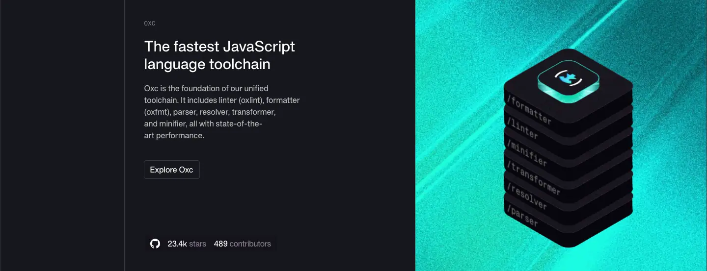
Five rows (Vite+, Vite, Vitest, Rolldown, Oxc), each 480–553px. Sticky rail on the left, copy in the middle, texture on the right.
| Row |
Title |
Texture |
Stars / contributors |
| Vite+ |
The unified toolchain for the web |
violet |
new (violet link) |
| Vite |
The build tool for the web |
violet/magenta |
83.9k / 1,390 |
| Vitest |
The next-generation test runner |
green |
17.4k / 844 |
| Rolldown |
The blazing fast JavaScript bundler |
orange |
14.0k / 243 |
| Oxc |
The fastest JavaScript language toolchain |
cyan |
23.4k / 489 |
Why. Identical structure + different hue = "one family, five products". Live GitHub numbers are trust signals that update themselves.
8 · Stats (y 4122–5007)
Light again. 192px statement "Trusted by millions of developers around the world" (40/53.3). Then a 2-up: "Total downloads" + 4,459,686,127 (60px Number Flow) | a canvas area chart from April 2020 to Today with a "Vite Downloads" dropdown. Then a 3-up: 130.8m+ weekly npm downloads · 83.9k+ GitHub stars · 1.4k+ contributors (48px).
Why. One giant number for awe, a chart for proof of growth, three small numbers for breadth.
9 · Mission (y 5007–5566)
#FBFAF7 band, 160px vertical padding, centered H3 "Our mission is to make the next generation of JavaScript developers more productive than ever before." (40/53.3, 3 lines), white "Learn more" button → /about.
10 · Investors (y 5566–5640)

74px row: "Backed by the very best in the dev tools space." + Accel, Peak XV, Sunflower Capital, Amplify logos in ruled cells.
11 · Featured resources (y 5640–6400)
120px spacer, then 520px: H3 "Featured resources & updates", "All Resources" → /blog, the .filter() code caption, and a carousel of 336×336 post cards with 8 dots. Then another 120px spacer.
12 · Footer (y 6400–7532)
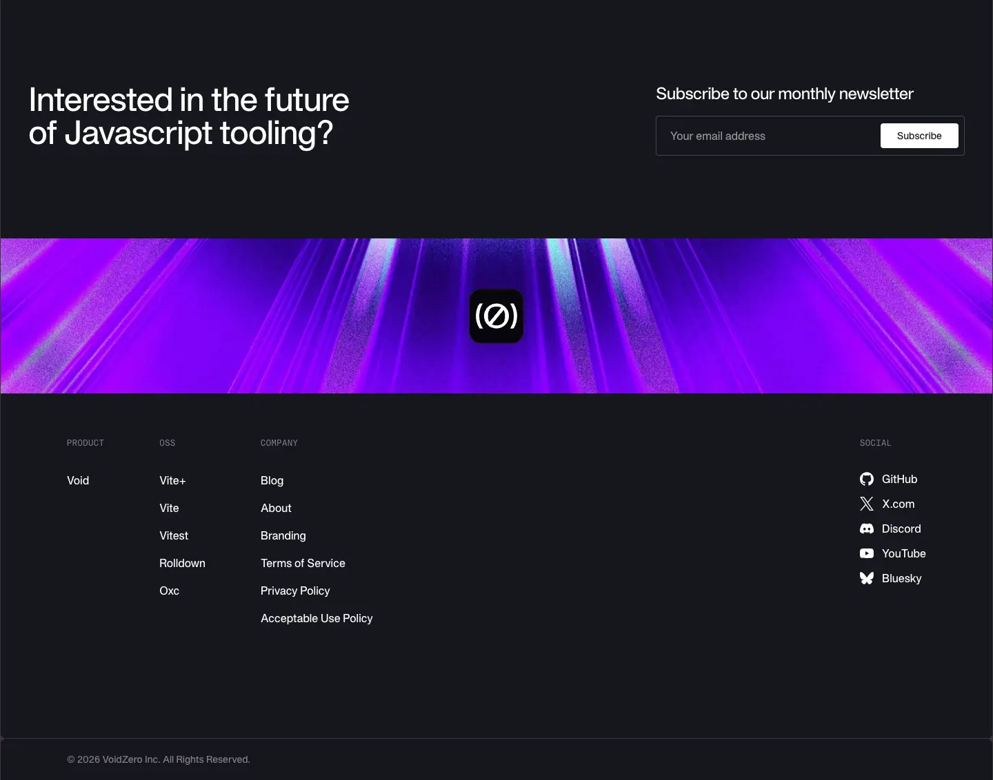
See shared footer.
Responsive
At 390: no banner, hamburger nav, H1 36px over 2 lines, small Rive stack (343_x_148_homepage_mobile.riv), logos scroll, product rows stack copy above texture, rail hidden, stats stack 1-up, footer centered. 8,382px tall.
About · voidzero.dev/about
1440 × 6,465px.
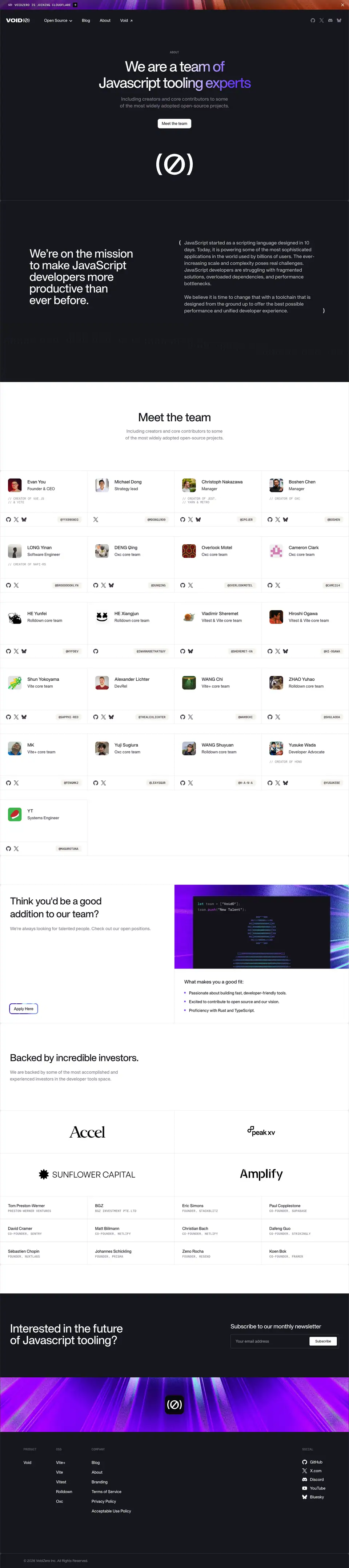
1 · Hero (y 128–826, 698px, dark)
Mono ABOUT eyebrow, H1 "We are a team of / Javascript tooling experts" (60/67.2, 500, -3px, white shine ending on violet "am of" and "g experts"), gray subline 18/28 two lines, white button "Meet the team" (radius 8), Rive (Ø) mark on a 480×217 canvas.
Why. Same hero grammar as home (shine headline, centered) in the inverse theme: the dark page feels like the "inside" of the company.
2 · Mission + ASCII (y 826–1575, 749px)
ascii-bg dark band. Left: H2 "We're on the mission to make JavaScript developers more productive than ever before." 48/48 white, 5 lines. Right: two paragraphs inside large thin parentheses ( … ) that echo the logo.
Why. The parentheses turn a manifesto into a "block of code". ASCII texture keeps the dark band from being flat.
3 · Meet the team (y 1575–1940)

Light. Centered H2 "Meet the team" 48/48 and a gray two-line subline.
4 · Team grid (y 1940–3527)
4-column grid of beige (#F4F3EC) cells. 21 members. Each: 48px avatar · name 18/28 500 · role 16/24 #3B3440 · optional mono credit (// CREATOR OF VUE.JS // & VITE) · GitHub/X/Bluesky icons · mono handle chip (12px 500 uppercase #3B3440).
Why. Credits of famous projects are the strongest hiring and trust signal; the mono // format keeps them understated.
5 · Hiring (y 3647–4218)
H3 "Think you'd be a good addition to our team?" + gray line + gradient-ring primary button "Apply Here". Right: a violet texture with a terminal let team = ["VoidZero"]; team.push("New Talent"); and an ASCII rocket, then three bullets ("Passionate about building fast, developer-friendly tools.", "Excited to contribute to open source and our vision.", "Proficiency with Rust and TypeScript.").
Why. The only primary (gradient) button on the site is the job application: the conversion VoidZero actually wants from this page.
6 · Investors (y 4218–5213)
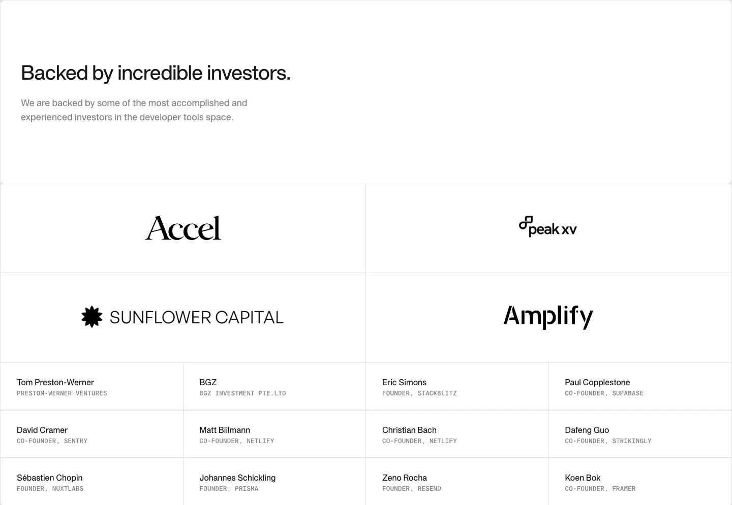
H3 "Backed by incredible investors." + subline, a 2×2 grid of large investor logos (Accel, Peak XV, Sunflower Capital, Amplify), then 12 angels in a 4-column list (name 16/28 500, mono uppercase affiliation 12px #867E8E).
7 · Footer
Blog index · voidzero.dev/blog
1440 × 4,371px. Lists all 42 posts in pages of 10 (pagination 1–5).
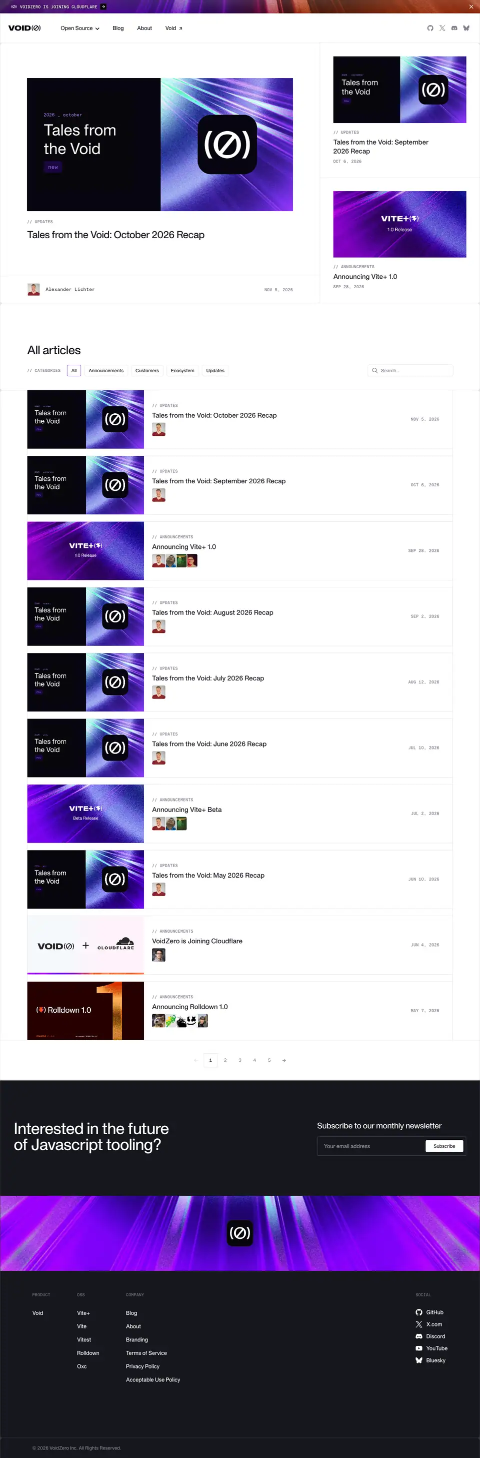
1 · Featured split (y 128–908)
Left 2/3: the newest post (cover ≈ 600×300, // UPDATES, title 30/37.5 400 -0.75px, author avatar + mono name, mono date NOV 5, 2026 right). Right 1/3: two stacked smaller cards (cover, label, title 20/27.5, mono date).
Why. Recaps and launches alternate; the split shows the newest of each type above the fold.
2 · All articles (y 908–3239)
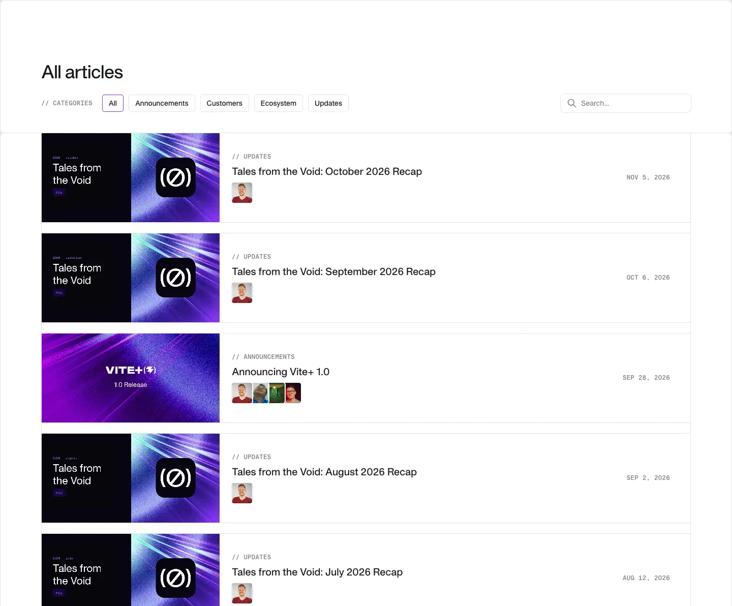
H2 "All articles" 36/40 500 -0.9px. Row of filters: mono // CATEGORIES label, chips All · Announcements · Customers · Ecosystem · Updates (14/20 500, capitalized, 1px stroke, radius 4; active chip with a violet outline), search field on the right. Then 10 ruled rows: cover 260×130 ≈ left, label + title + stacked author avatars middle, mono date right.

3 · Pagination
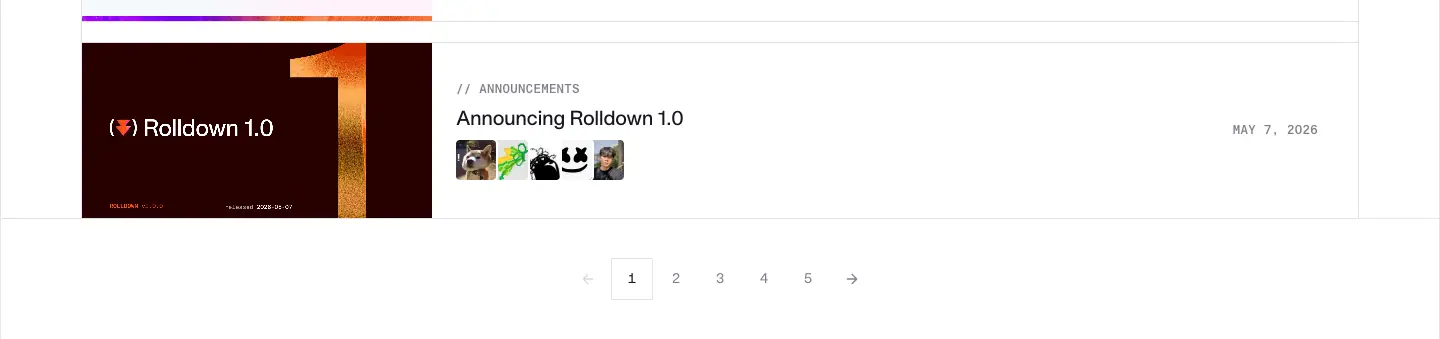
Centered « 1 2 3 4 5 », current page boxed.
Why. A plain, scannable list fits a blog whose readers search for a specific release; covers carry the visual brand so the list can stay simple.
Phone

Blog post template · announcements
Captured: /posts/announcing-vite-plus-1-0 (1440 × 7,731) and /posts/announcing-series-a (1440 × 3,587). Same template; 24 posts use it.

1 · Post hero (626px)
| Element |
Value |
| Category |
// ANNOUNCEMENTS mono 12/16 500 +0.3px #867E8E |
| H1 |
48/60, 400 (renders 500), -2.4px, #16171D, left column |
| Date |
mono SEP 28, 2026, bottom of left column |
| Cover |
right column, ≈ 600×300, product texture + wordmark |
| Byline bar |
32px avatars overlapped + mono names; right: clock + 5 MIN READ, "Copy Link" split button |
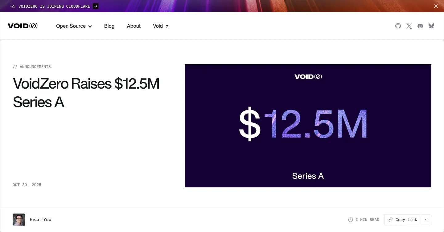
2 · Body with sticky TOC
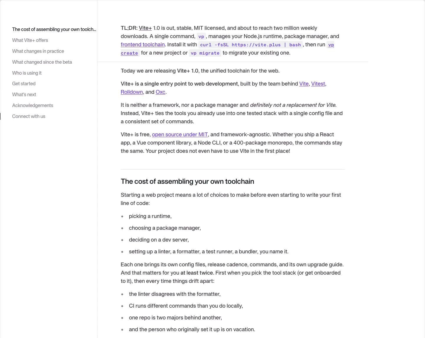
Left: sticky table of contents (16/24.9, #867E8E, -0.32px; current item dark with a 1px bar). Right: article ≈ 690px wide.
| Element |
Value |
| Body |
18/28, #3B3440 |
| Bold lead |
"TL;DR:" 600 |
| Links |
500, #6C3BFF, underline on hover |
| Inline code |
KH Teka Mono 15.75px 600 #6C3BFF on rgba(142,150,170,.14), radius 4 |
| H2 |
24/32 600 -0.48px, with a 1px rule above each H2 section |
| H3 |
20/28 600 -0.2px |
| Lists |
small round bullets, 18/28 |
3 · Tables
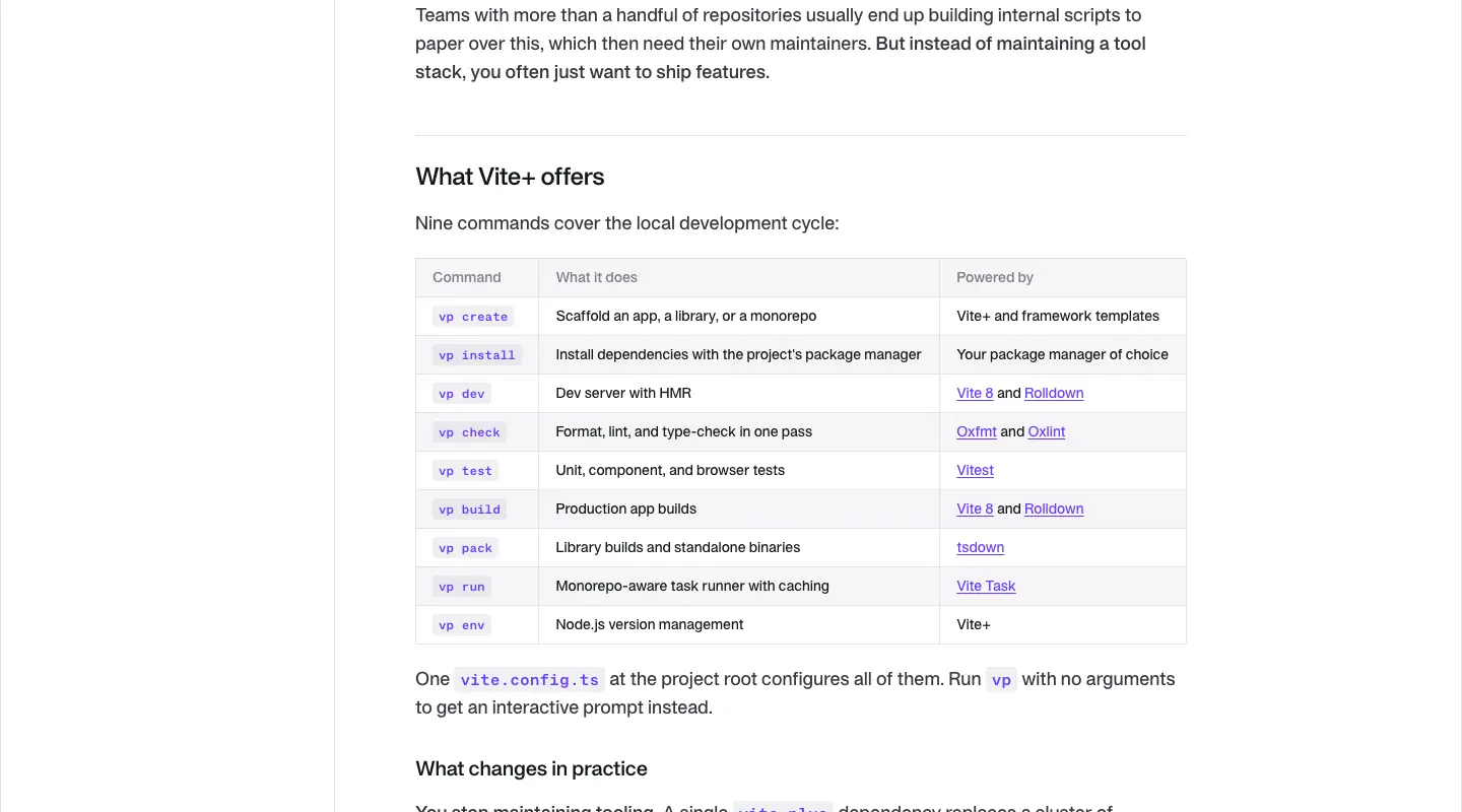
"Nine commands cover the local development cycle": a 3-column table (Command · What it does · Powered by), 14/21, mono violet command chips, 1px rules, header 600 gray.
4 · End matter
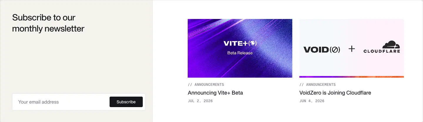
"Subscribe to our monthly newsletter" (30/37.5) with an inline field, and 2 related post cards (// ANNOUNCEMENTS, title 18/24.75). Then spacer and footer.
Why this template. The post reads like documentation (TOC, tables, code), because the readers will act on it: install, migrate, configure. Violet code + links make every actionable token findable at a glance.
Phone

Monthly recap template · the changelog
VoidZero has no /changelog. Its changelog is the monthly "Tales from the Void: Recap" post (18 in the feed). Captured: /posts/whats-new-oct-2026 (1440 × 14,851) and /posts/whats-new-sep-2026 (1440 × 9,688).

1 · Hero
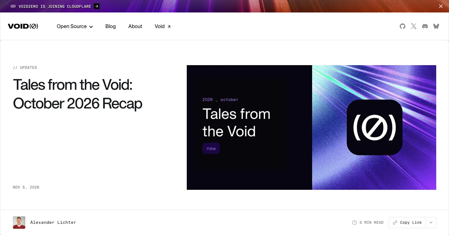
Same post hero, category // UPDATES. The cover is the recap template: black left half with a mono 2026 _ october tag, "Tales from the Void" in white, a violet new chip; violet streak texture right with the (Ø) app tile.
2 · Lead story
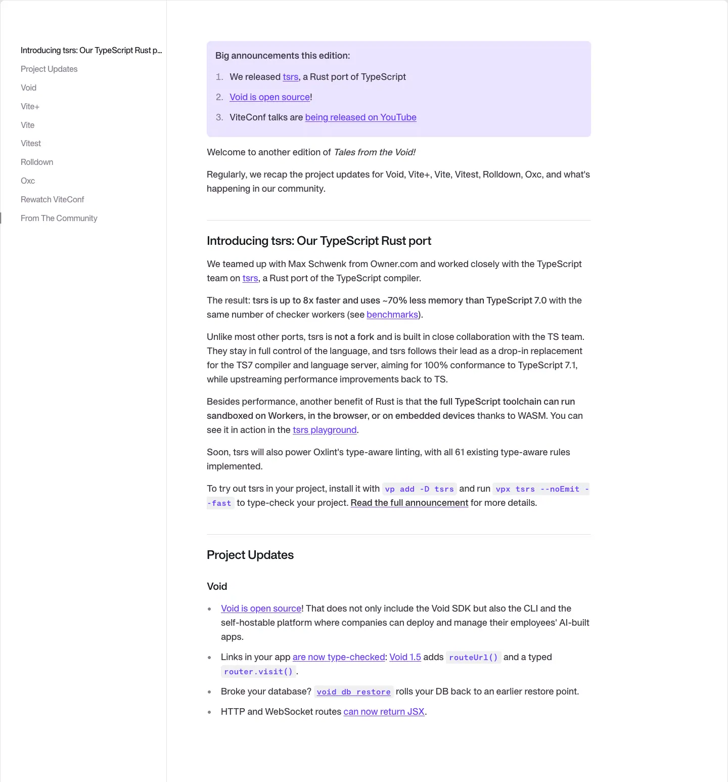
One H2 lead feature ("Introducing tsrs: Our TypeScript Rust port"), then Project Updates.
3 · Project updates
One H3 per project (Void, Vite+, Vite, Vitest, Rolldown, Oxc) with short bullets. Each bullet is one change, with inline code (vpx, --watch) and a link to the PR or docs. Ends with "Rewatch ViteConf" and "From The Community".
4 · Embedded X posts
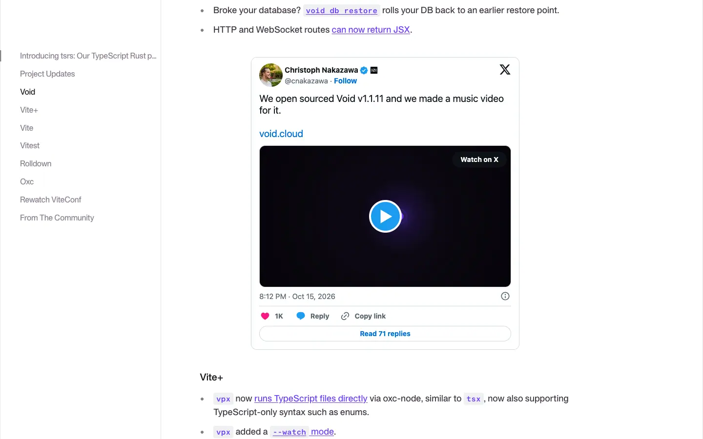
11 embedded posts from X (Twitter widget iframes, 489–875px tall each) on the October issue. They render blank in full-page captures; this viewport capture shows one.
Why this format. Five projects ship weekly; a monthly digest grouped by project lets readers skip to the tool they use. The sticky TOC lists the projects, so the recap doubles as a changelog index. Social embeds bring community voices in without writing new copy.
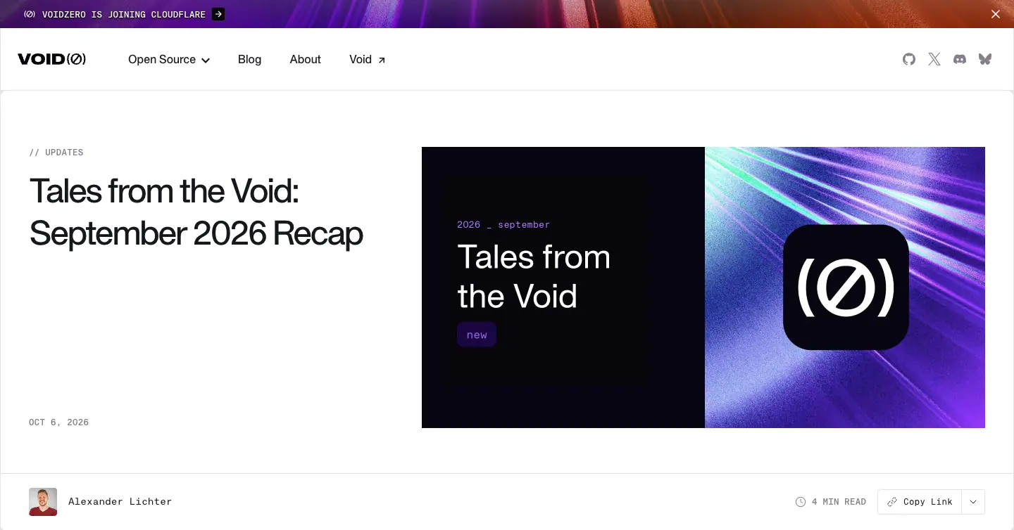
Customer story template
Two case studies exist: Framer (captured, 1440 × 5,212) and PLAID.
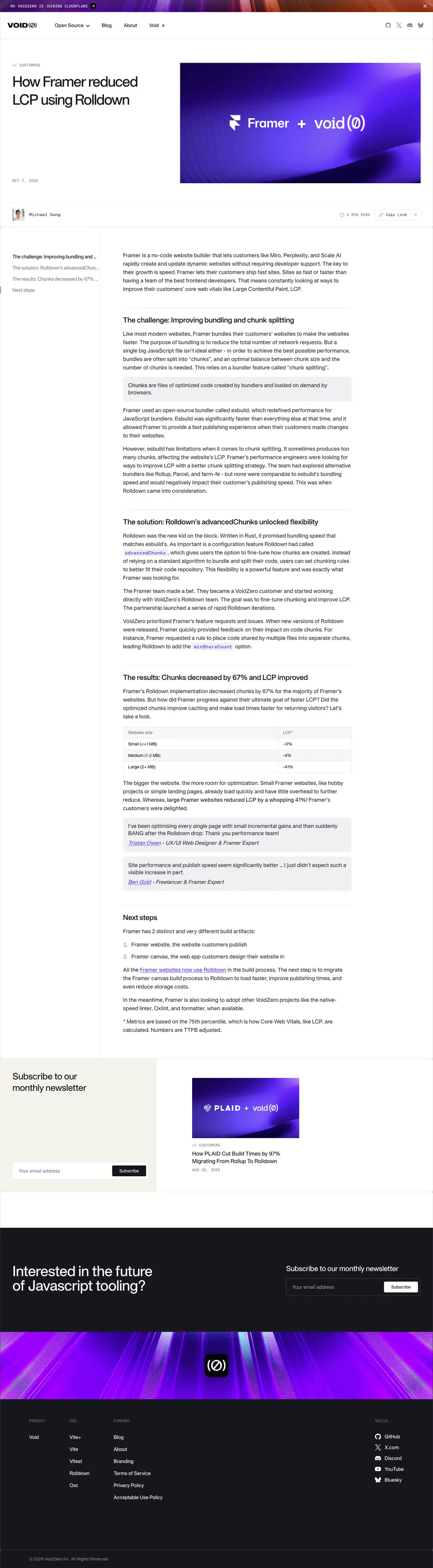
1 · Hero
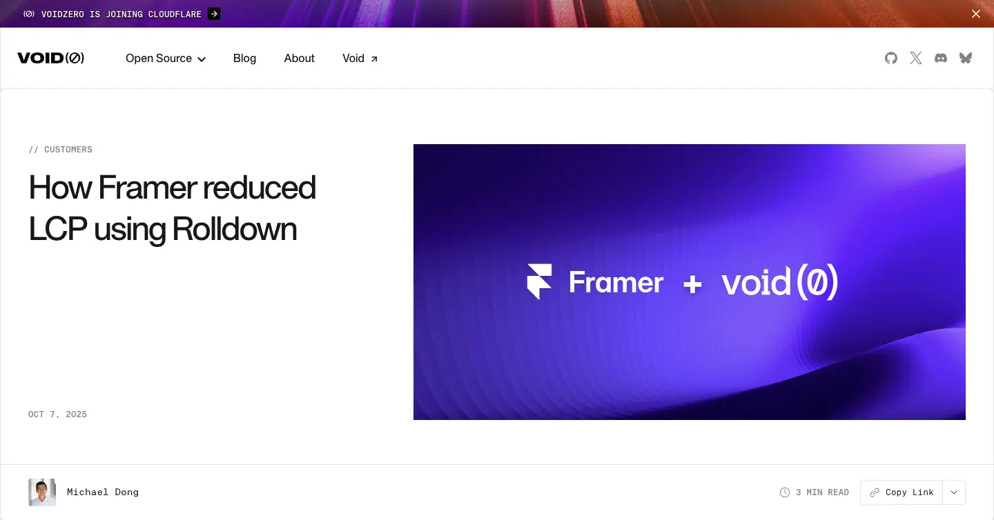
Post hero with // CUSTOMERS. H1 "How Framer reduced LCP using Rolldown" (48/60). Cover: a soft violet abstract with the lockup "Framer + void(Ø)".
2 · Body
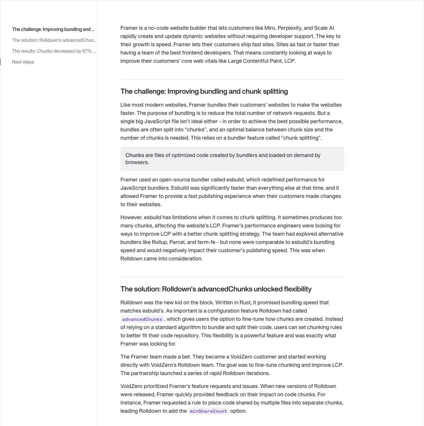
Three fixed H2s: The challenge: …, The solution: …, The results: Chunks decreased by 67% and LCP improved …, plus "Next steps". The result is in the heading, so a skimmer gets the number without reading the body.
3 · Related

Subscribe block + a related card ("How PLAID Cut Build Times by 97% Migrating From Rollup to Rolldown").
Why. Challenge → solution → result is the format engineering managers expect. Putting the metric in the H2 serves the skim reader, and the partner lockup on the cover lends the customer's brand to the post.
Newsletter · voidzero.dev/newsletter
1440 × 1,864px.
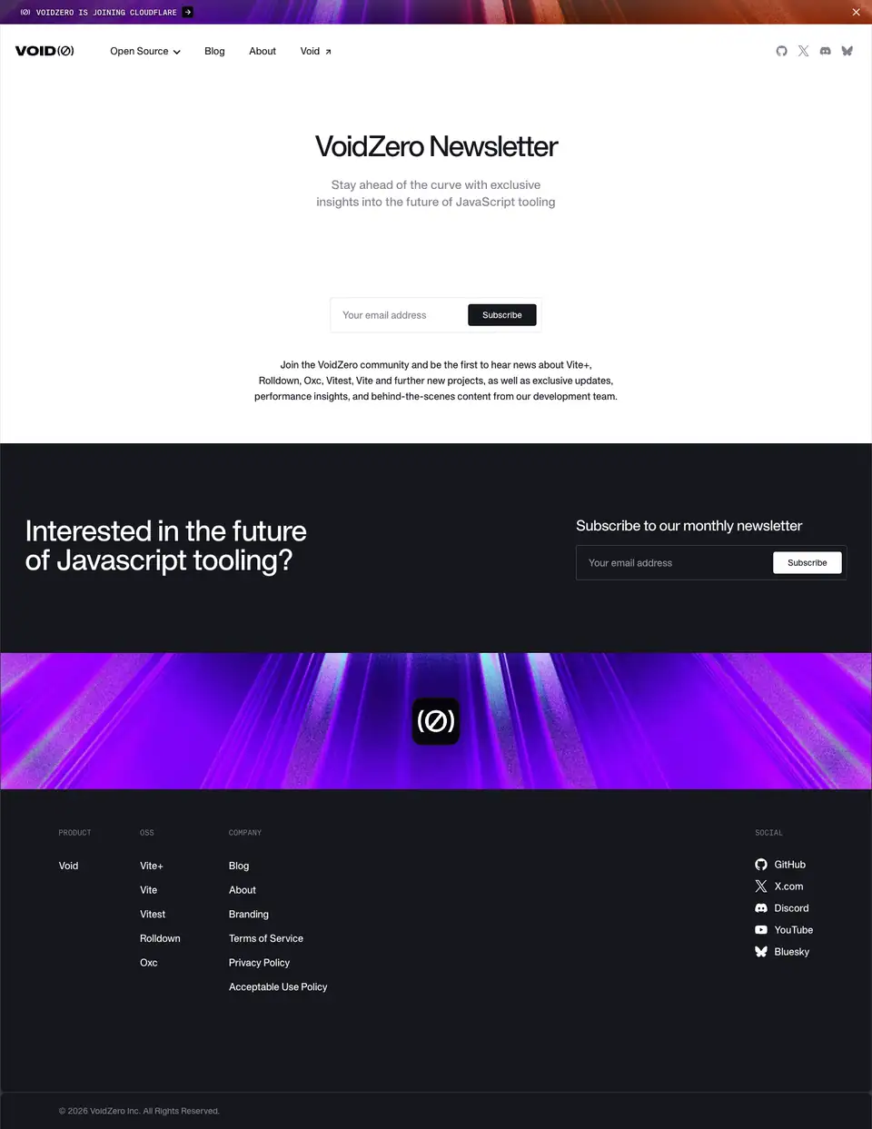
1 · Grid-paper hero (299px)
.grid-background (fine square grid). H1 "VoidZero Newsletter" 48/67.2 500 -2.4px centered; 18/28 gray subline "Stay ahead of the curve with exclusive insights into the future of JavaScript tooling".
2 · Subscribe (304px)

Email field + black "Subscribe" button, centered, then a 3-line gray paragraph about what you get (Vite+, Rolldown, Oxc, Vitest, Vite news; performance insights; behind-the-scenes).
Why. One action, nothing else. The grid paper keeps it on-brand with zero imagery. The same signup also appears in every footer and at the end of every post, so this page exists for direct links from social posts.
Legal · voidzero.dev/legal/terms
Also /legal/privacy and /legal/acceptable-use (same template). Terms: 1440 × 8,408px.

1 · Title (221px)
H1 "Terms of Service" 60/60 400 -3px left; Last Updated / March 8, 2026 mono right.
2 · Body
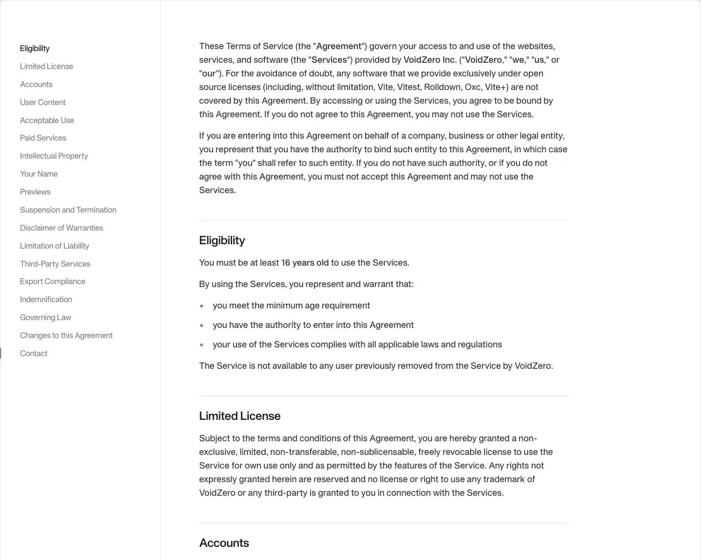
Sticky TOC of 20+ H2 sections (Eligibility, Limited License, Accounts, User Content, Acceptable Use, Paid Services, Intellectual Property, …), H2 24/32 600 -0.48px, body 18/28 #3B3440.
Why. Same post template, so legal pages inherit good reading typography for free. "Paid Services" in the terms hints at the commercial product (Void).
Branding · voidzero.dev/branding
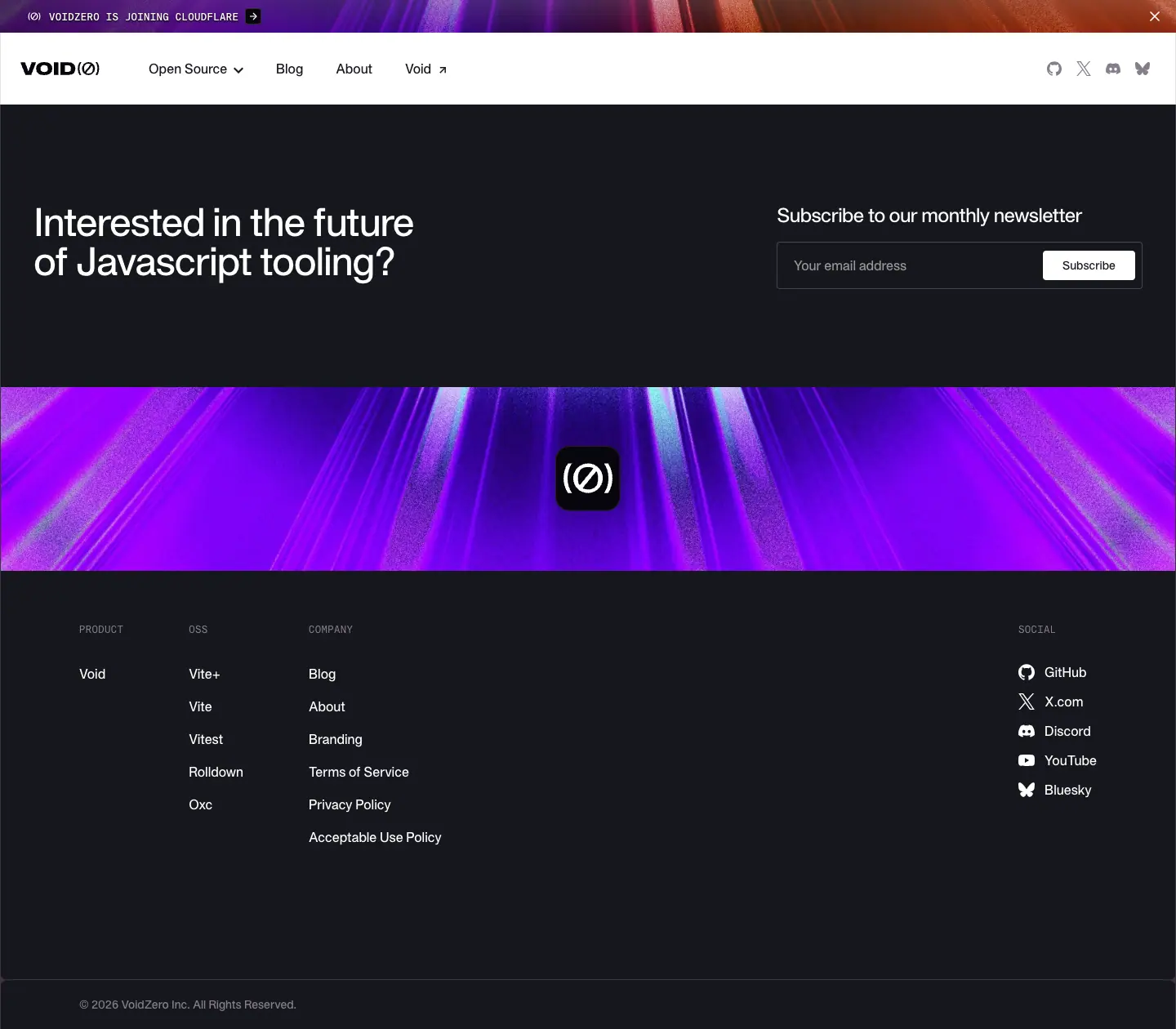
The route returns 200 and is linked from every footer ("Branding"), but on 2026-11-21 it renders only the header and footer (1,260px tall, no main content). The VitePress manifest lists branding.md, so the page exists in source; its content did not render in the capture (checked twice, after networkidle and a 3s wait).
The page's only off-site link is the brand kit: voidzero-dev/community-design-resources › brand-assets. See 10 · Brand assets for its contents (59 files: logos, icons, wallpapers) and licence.